
What is English Script?
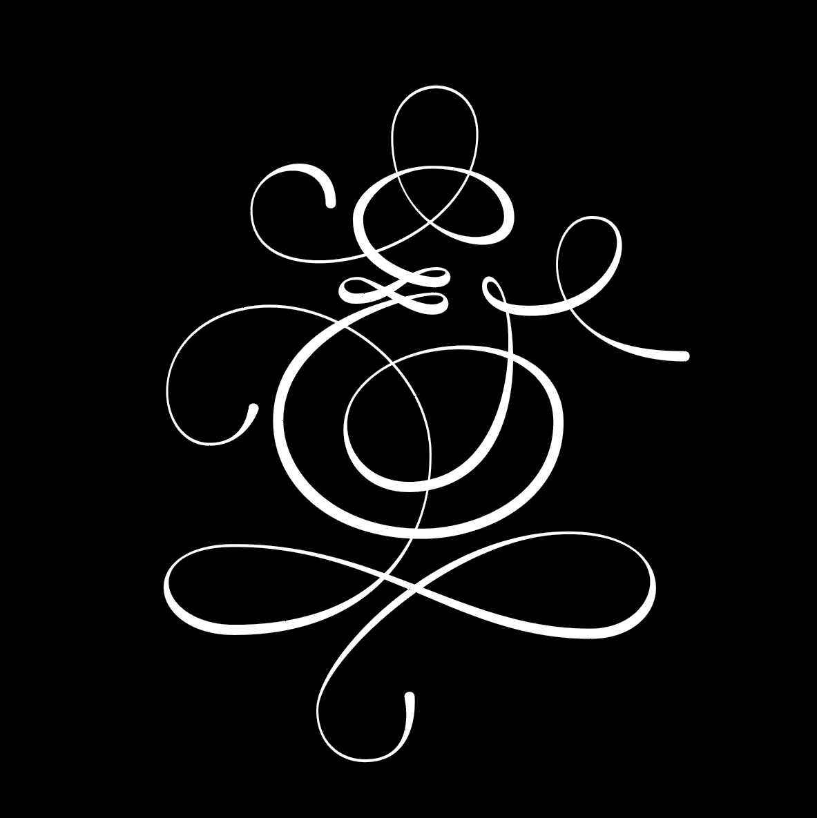
English script, or you can say traditional western calligraphy, has been around for hundreds of years. It is one of the oldest and most respected forms of art and expression of the written word. It has been used for centuries to convey religious messages, royal decrees, and even everyday correspondence.
Where can you find it?
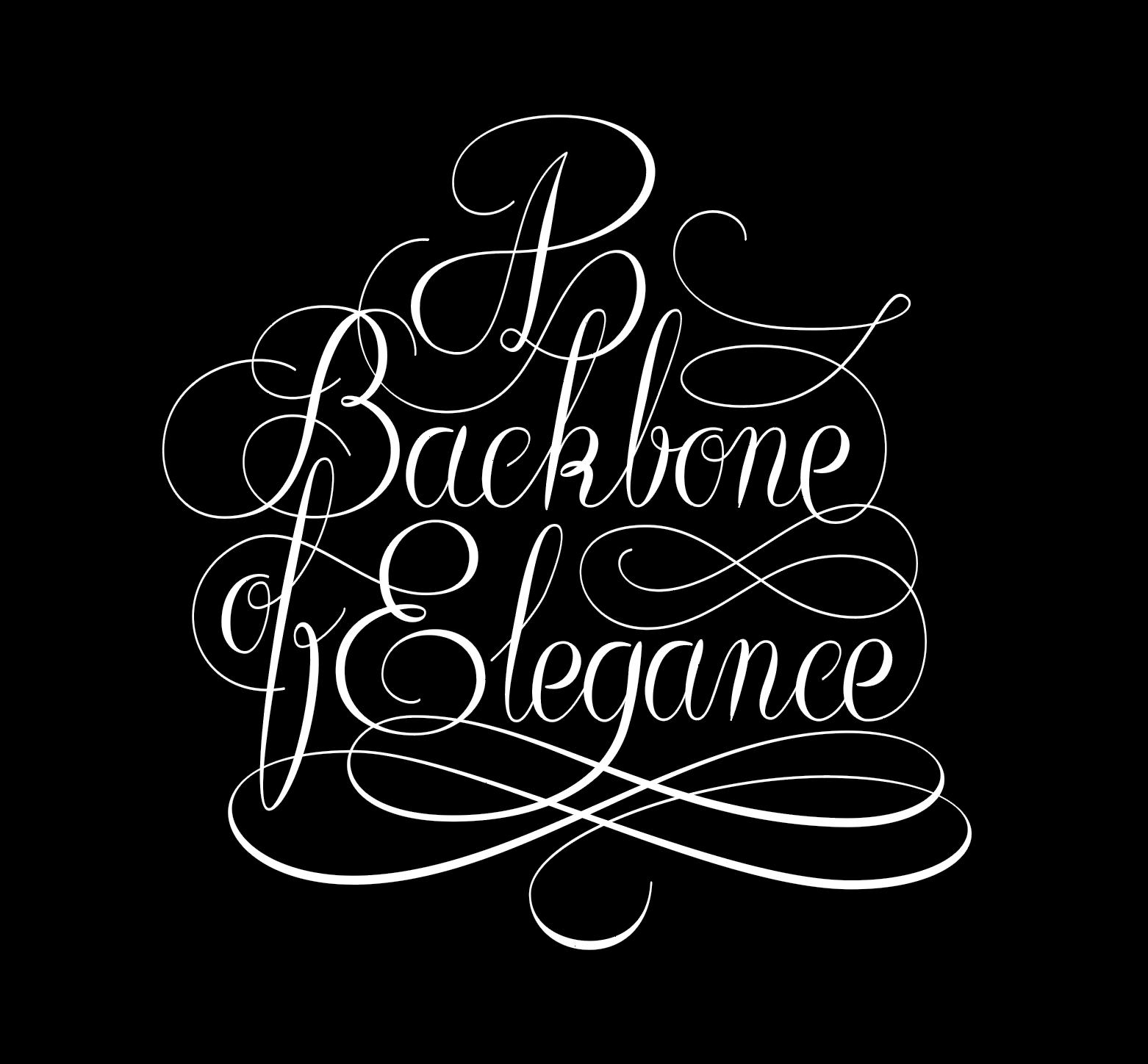
This style is most suitable for designs that require a more formal and elegant look, such as wedding invitations, certificates, diplomas, and other documents of importance. It is also used in logo design and typography to create a classic and timeless look.
Common attributes
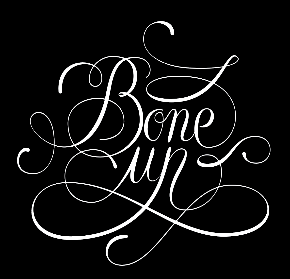
One of the attributes is using a pointed nib pen to create a smooth, even, and balanced look. Also, unlike in the case of modern calligraphy style, the writing has a particular order and structure, with each letter written in a strict rhythm and specific width, ratio, and weight. The letters are then linked at the end to create a cohesive look.
How to make an English script design with LTTR/INK
If you are new to LTTR/INK you can find a step by step instructions on how to use it—from installation to drawing basics here.
- For this style are typical rich curvy swash letters. Try to use as few vector points of the letter skeleton as possible so the curves would be smoother.
- Then add the vector points at the areas of the stroke where you want to have total control. These are the places where the LTTR/INK ellipses are generated, which allow you to adjust the stroke parameters. It doesn’t necessarily need to be at the extremes.
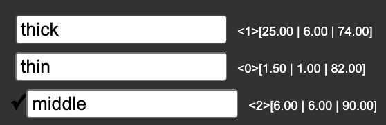
- PRO TIP: This calligraphy style requires no more than three stroke styles: thin, thick, and middle.
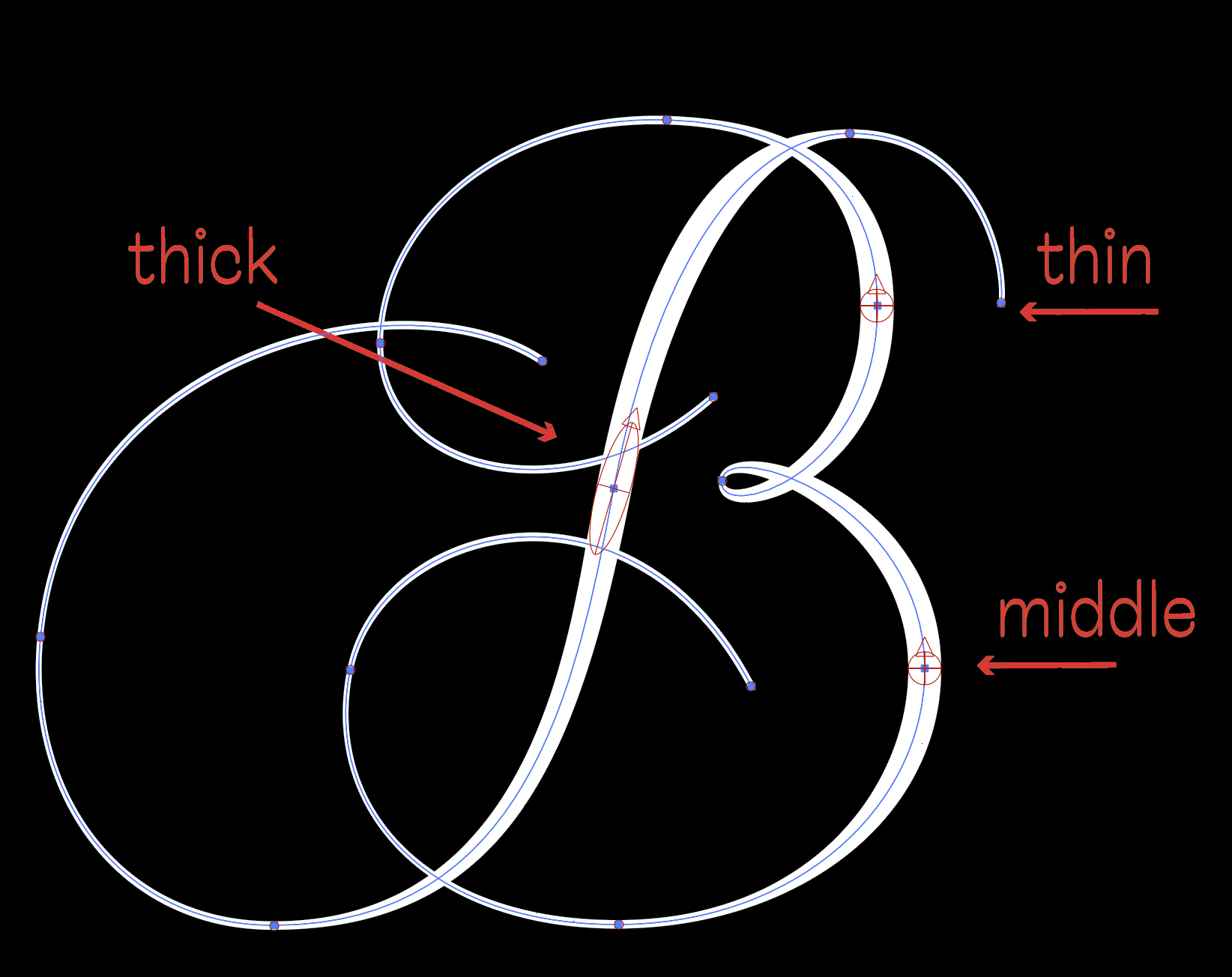
The “thick” and “middle” styles have the same width but different angles and heights. The “thick” style is best suited for long straight vertical parts of the letter, and the “middle” style works best for curvy areas.
- If you initially invest some time to set your stroke styles, you can adjust your design quickly and effortlessly by switching the suitable styles. It also allows you to use the transformation tool without messing up your design.
- Are you satisfied with your design? Great! The last step you need to do is to expand the stroke. You’ll get a vector outline that is easily editable the traditional way so that you can adjust all the little curve imperfections. Beware, the vector points are automatically generated at the places where former ellipses touched the shape edges.
Feeling inspired? Download the latest version of LTTR/INK Adobe Illustrator plugin here and start drawing immediately. So let it be written, let it be done!

