Runes' unique characteristics are instantly recognisable. The mystic angular script was used in Northern Europe from 160 AD until the Renaissance. Explore the Runic style in this comprehensive article.
Runes are an early form of written communication used primarily by the Germanic tribes and later by Viking-age communities, before the widespread adoption of the Latin alphabet in northern Europe. This writing system emerged as an attempt to visually represent the sounds of early Germanic languages, and was widely used from approximately the 2nd century AD to around 1200 AD (Moltke, 1985). Evidence of runic inscriptions appears by the second century – for example, the Vimose Comb from Denmark (c. 160 AD) bears one of the oldest known runic inscriptions – and runes continued in use through the early medieval period. Their geographical reach spanned from Anglo-Saxon England in the west to eastern Sweden in the north and to southern Germany in the south (Freeborn, 1998).
Introduction
Runa , “rune”, carved on a rune stone.
Photo: Bengt A. Lundberg, CC-BY 4.0
The word rune itself comes from the Proto-Germanic term rūnō , meaning “secret” or “mystery,” reflecting the perceived enigmatic or magical character of these symbols (Morris, 1988). This term is as old as the runes, appearing in early Germanic languages and persisting in Old Norse, where phrases like rísta rúnar (“to carve runes”) and rita rúnar (“to write/draw runes”) illustrate how runes were applied to different media (Moltke, 1985). Not limited to stone monuments, runes were commonly carved into wood, bone, metal, and other materials. Indeed, the Old Norse verbs for rune carving imply that even inscriptions on hard materials like stone were conceptually similar to writing on wood (Looijenga, 2003). This versatility allowed runic writing to serve both practical and ceremonial purposes.
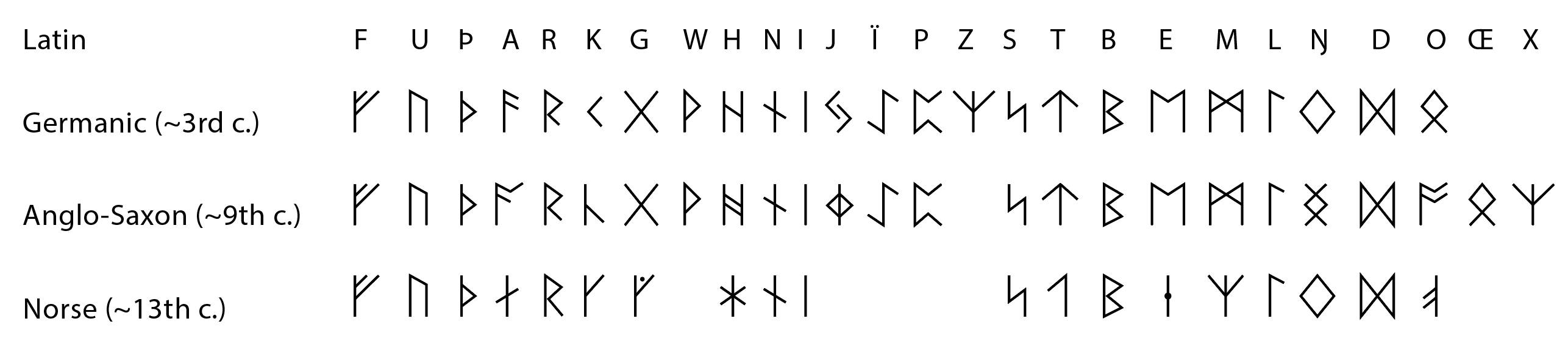
The runic alphabet is most commonly associated with the sequence known as the futhark – named after its first six letters, ᚠ (F), ᚢ (U), ᚦ (Th), ᚨ (A), ᚱ (R), ᚲ (K). There were regional variations of this alphabet, covering the Germanic continent, Scandinavia, and Anglo-Saxon England. The earliest and most widespread version is the 24-letter Elder Futhark, used by Germanic peoples of the Migration Period (c. 2nd–7th centuries AD). Later, this system was adapted into the Anglo-Saxon Futhorc (expanded to 28–33 letters to suit Old English) and the Younger Futhark (a reduced 16-letter Scandinavian variant used during the Viking Age) (Freeborn, 1998). Runes are often viewed through a mystical lens, but many surviving inscriptions have clearly functional content: there are examples of runic texts recording laws, commemorating the dead, marking ownership, or even conveying personal messages and graffiti (Lüthi, 2006). These artefacts offer unique insight into the early Germanic-speaking world and demonstrate that runes were not exclusively magical symbols, but a working writing system.
Runes remained the dominant writing system in Scandinavia well into the early Christian period. In Sweden, for instance, runic script was commonly used up through the 11th and 12th centuries, coexisting with the Latin alphabet introduced by Christianity (Jónasson, 2002). Over time, contact with Latin writing did influence the runic alphabet. Additional runic symbols and variants were developed during the Middle Ages, such as dotted (stung) runes, to better represent the sounds of the evolving languages, in part due to Latin influence on spelling conventions (Palumbo, 2022). However, even after runes were largely supplanted by Latin script for everyday writing, they did not disappear. Instead, they continued to be used in decorative and symbolic contexts – for example, on memorial stones or cryptic ornaments on ceremonial items – preserving their cultural significance. Runes maintained an aura of mystery and were often associated with heritage and magic in folklore and later medieval literature. In modern times, they have experienced revivals in various forms, from scholarly study to popular and neo-pagan usage, underscoring their enduring legacy.
Long after the Latin script had supplanted everyday use of runes, they found new life as day markers in perpetual calendars. This example dates to 1669.
Photo: Kalmar läns museum
Style
Style Characteristics of Runes
Runes are best known for their distinctive angular and minimalist design. Nearly all rune shapes consist of straight lines with sharp angles, and few (if any) curved strokes. This stark style is not arbitrary; it reflects practical constraints of the writing materials and tools used by early rune-carvers (Moltke, 1985). Unlike scripts that evolved from painted or pen-written calligraphy, the runic characters were created primarily for carving, especially into wood, which is fibrous and prone to splitting. Using straight lines and avoiding horizontal strokes with the wood grain helped prevent the material from cracking or splintering while being inscribed. As a result, the classic runic letters have an almost “geometric” simplicity, optimised for being cut with a knife or chisel (Looijenga, 2003) even when runes were eventually carved into stone, the same angular style persisted, likely due to tradition as well as the continued use of similar carving techniques.
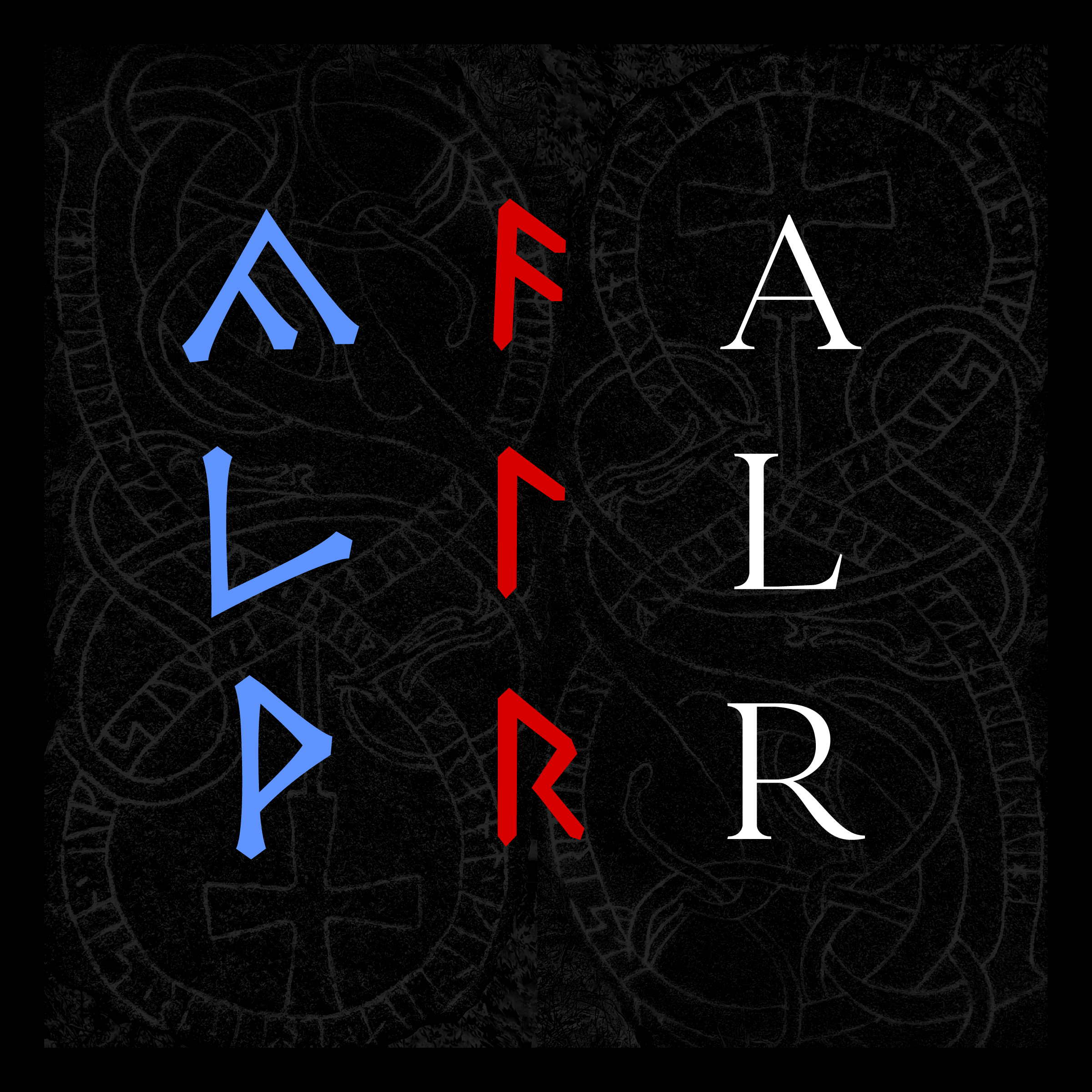
Each rune was composed of a combination of vertical and diagonal strokes. For example, the rune ᛚ (representing /l/) consists of a vertical line (stave) with an angled branch or arm , and ᚠ (representing /f/) is likewise formed by a stave but with two diagonal lines attached (twigs). These forms were efficient in carving with consistent depth and width. The overall impression of runic text is “sharp” and linear, a primitive appearance when compared to the more fluid shapes of contemporary Latin or Greek letters. However, this angular design was an intentional adaptation to the medium and does not imply unsophistication – on the contrary, it shows a clever adjustment of writing technology to environmental needs (Morris, 1988).
Because runes were cut with relatively uniform incisions (each stroke being the resulting width of whatever tool and technique was being used), the line thickness in runic inscriptions tends to be consistent throughout. This is in contrast to scripts written with brush or pen, where stroke width can naturally vary (as seen in Latin writings where vertical strokes are often thicker than horizontal ones due to evolution from brush or calligraphy techniques). The uniform stroke width of runes gives them a blocky, even-weighted appearance, reinforcing their visual unity. It also means that when runes were written small or large, the proportions of the strokes generally remained the same.
Uppland Runic Inscription 871, showcasing the 11th-century runemaster Åsmund's work in the Early Urnes Style, repainted in accordance with modern approximations of its original coloration.
Photo: Mceder, Public Domain
Another stylistic characteristic is the absence of separate uppercase or lowercase forms; each rune was essentially drawn in a single, simplified style. Variation in size could occur, but it was usually a matter of scale rather than distinct letterforms. Overall, the design of runes is functional and streamlined, well-suited for carving, and aesthetically striking in its abstraction.
Typographic Variations and Regional Styles
Although runes maintain a basic uniformity, there were typographic variations across different regions and time periods. As the use of runes spread and evolved, rune-carvers introduced slight modifications in shape, stroke order, and ornamentation. For instance, early medieval Scandinavian rune stones show subtle differences from the older Migration Period carvings: some later runes have more curved or stylistically embellished forms, influenced by Insular art and possibly by Latin script styles (Åkerström, 2020). In Anglo-Saxon England, where the Futhorc expanded the rune set, some new characters and modified shapes appear more rounded or complex, reflecting interaction with Latin cursive writing (Freeborn, 1998).
A comparison between a selection of runic systems between the first until the last widespread usage.
Despite these developments, the core principle of angularity remained. Some regional rune traditions feature unique characteristics: the Swedish-Norwegian Rök runes (a variant of the Younger Futhark) and the Latin-influenced Medieval runes (13th–14th centuries) sometimes have small ornamental ticks or serifs on the ends of strokes (as in classic Latin script), indicating a late blending of rune tradition with manuscript calligraphy (Åkerström, 2020). Similarly, in England, certain runic inscriptions on manuscripts (like those in the Franks Casket) show decorative elements not found in early carvings.
Spacing and alignment also varied. In some inscriptions, runes are tightly crammed to save space (for example, on small metal objects or coins), whereas on large rune stones, the letters might be more widely spaced and even aligned in columns or arches to fit a design. Moreover, different carvers had personal “handwriting” styles – experts can sometimes identify a particular rune-master by the way he carved certain strokes or shaped particular rune characters (Moltke, 1985).
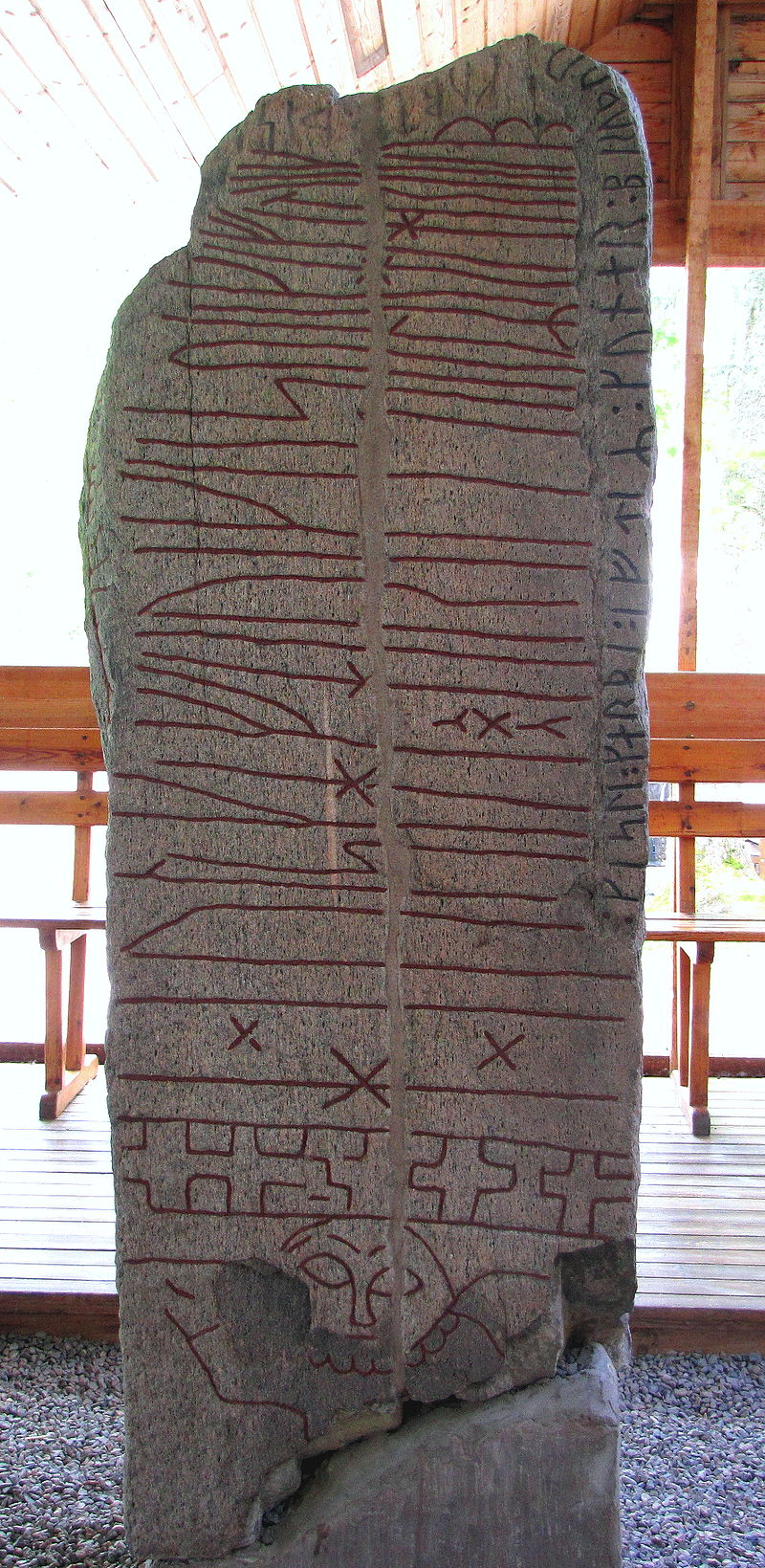
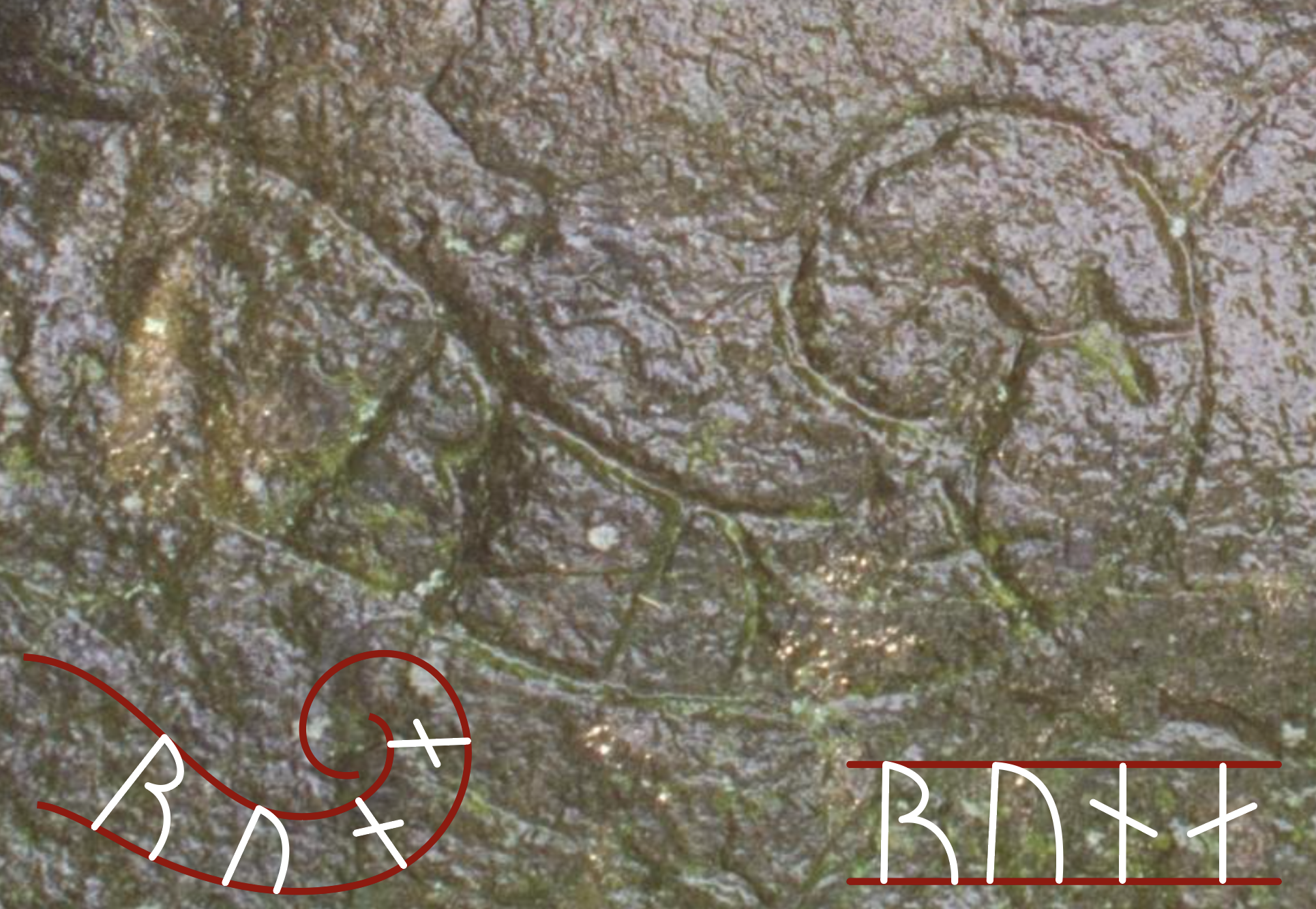
The runes on the west side of the Sparlösa stone uses extremely tall staves, which contrast against the more compact and common sized characters on the right edge; a clear example of typographical expression.
Photo: Rolf Broberg, CC BY-SA 3.0
Despite these individual and regional variations, the fundamental look of runes – simple strokes at consistent angles – remained recognisable everywhere the script was used.
Runic inscriptions also made use of basic punctuation and dividers. Designated marks such as single or multiple dots, and sometimes crosses or small vertical lines, were used to separate words or phrases (Åkerström, 2020). For example, pairs of dots (resembling a colon) are frequently seen dividing words on rune stones. In some cases, rune carvers added decorative flares or word-separating symbols that also enhanced the visual appeal of the text. These practices indicate that runic writing did have a concept of spacing and formatting, even if not as standardised as modern punctuation.
Writing Style and Presentation
When carved on larger surfaces – particularly the monumental rune stones of the Viking Age (c. 8th–11th centuries) – runic text was often presented with a clear sense of layout and aesthetic composition. A common convention on rune stones was to frame the text between two horizontal or vertical boundary lines, effectively creating a text panel. This helped organise the inscription and ensure legibility, as the straight borders kept the runes aligned (Åkerström, 2020). In many cases, especially in late Viking Age Sweden, rune inscriptions were integrated into elaborate designs on the stone.
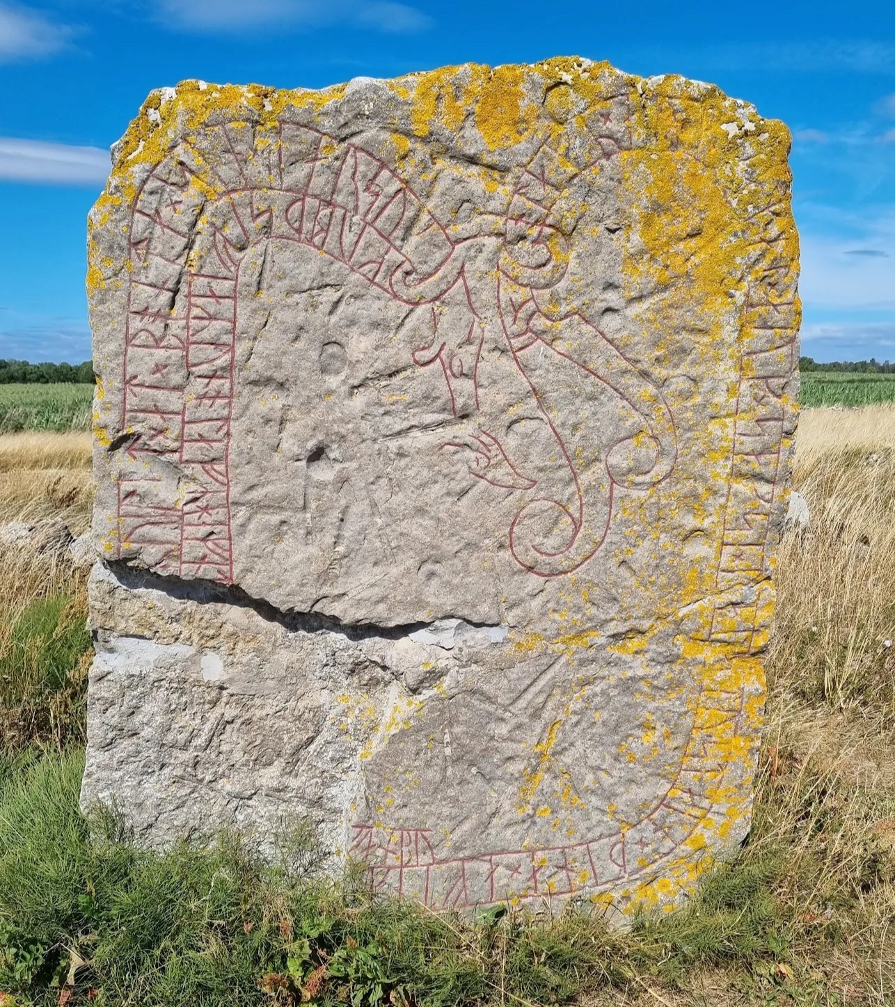
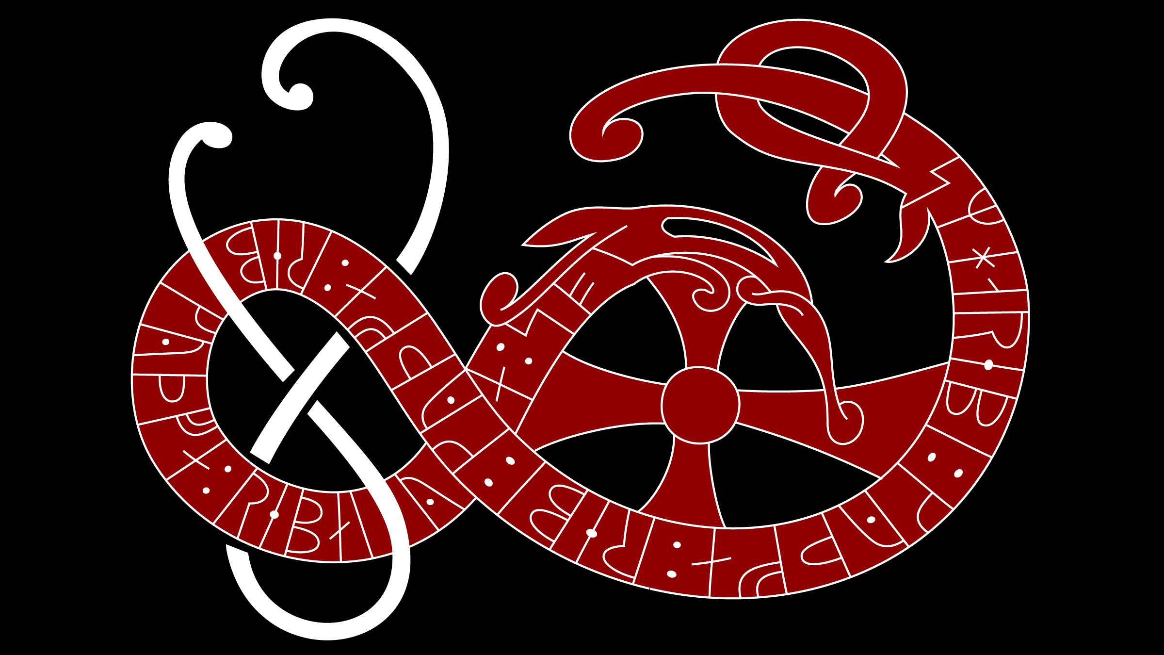
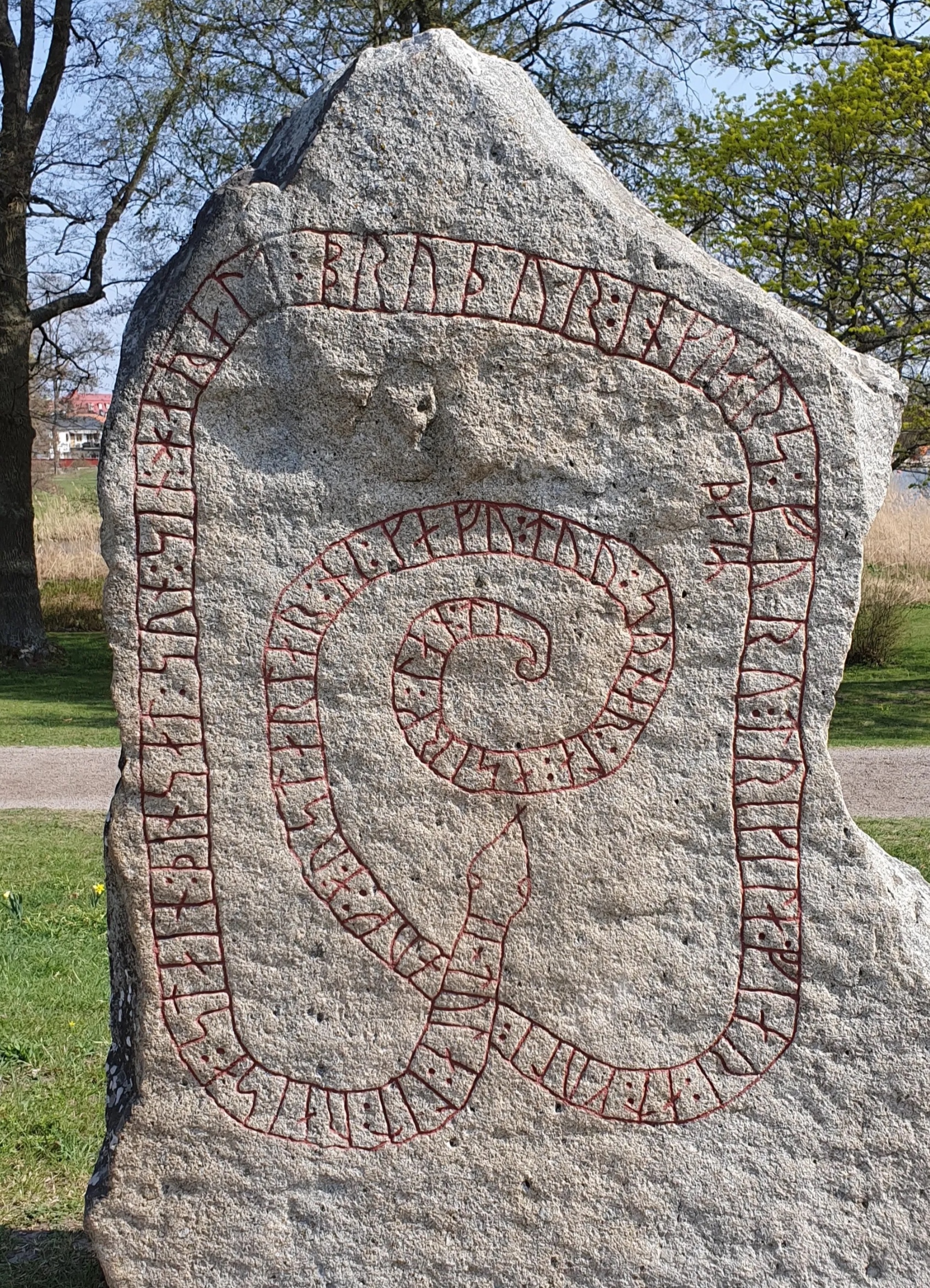
Rune stone in Lerkaka, Sweden, displaying a typical design with runic letters along the body of a snakelike dragon.
Photo: Måns Grebäck
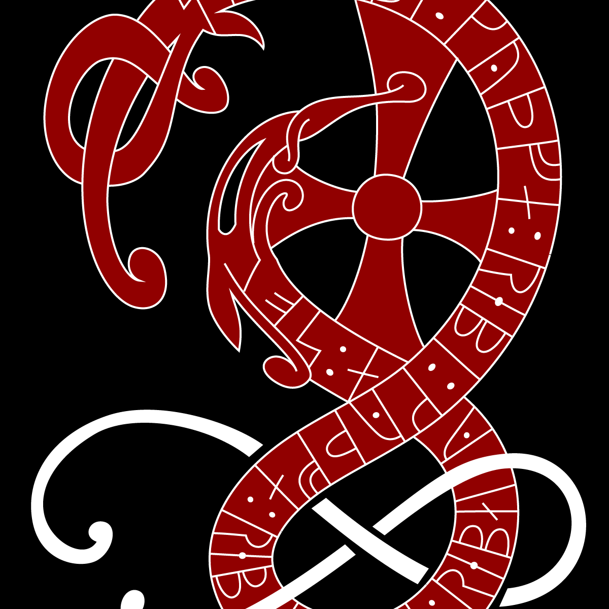
One popular design element was the serpent or dragon motif : the runic text was inscribed along the body of a carved serpent that loops around the surface of the stone. The text would begin at the head and often end at the tail of the creature. This design not only made the inscription more visually engaging but also imbued it with symbolic meaning, as snakes or dragons could have protective or ritual significance. Numerous rune stones exemplify this style, where the letters themselves form part of the artwork (Åkerström, 2020). From a practical standpoint, the curved layout required the runes to follow the shape of the serpent, but carvers managed to maintain clarity by keeping each character separate and oriented correctly along the curve.
Smaller objects, like wooden sticks or metal jewelry, might be inscribed in a simpler linear fashion (either left-to-right or right-to-left, since runes could be written in either direction). On such objects, the runes sometimes appear without any bordering lines, but the carver might still plan the spacing carefully to fit the available area.
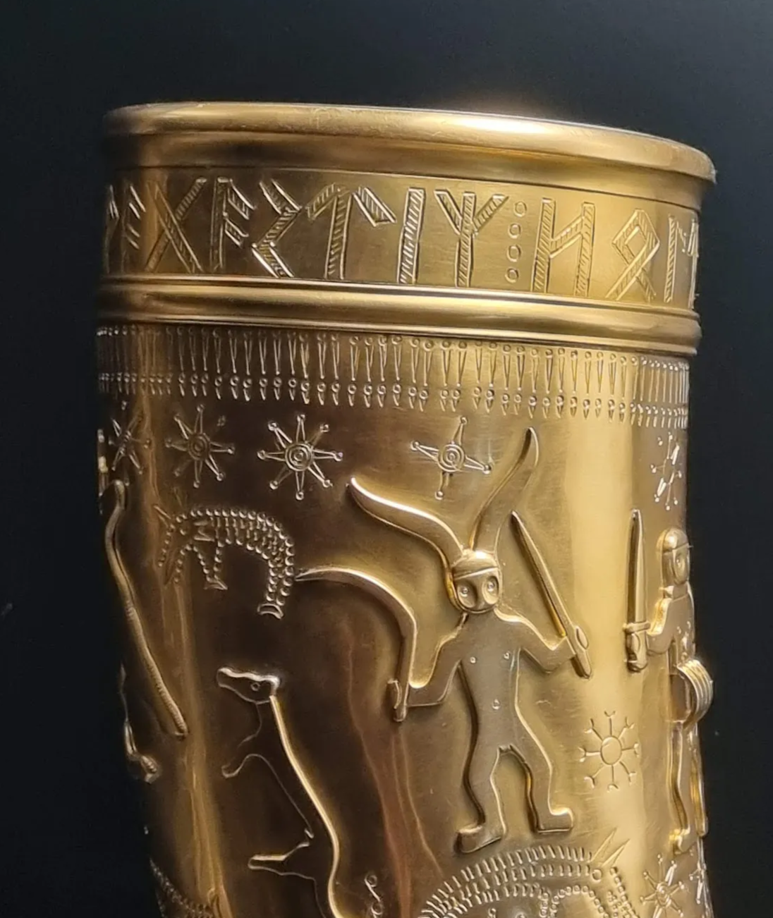
The early 5th-century Golden Horns of Gallehus (Denmark) were a pair of gold drinking horns with one of the horns bearing runic inscriptions wrapping around it in a continuous band. The image shows a replica at National Museum in Copenhagen, as the originals were stolen in 1802.
Photo: Måns Grebäck
The orientation of runic writing could vary. In contrast, most inscriptions read left-to-right (like Latin), some rune stones use boustrophedon style (alternating direction each line), and others, especially earlier ones, occasionally run right-to-left. Additionally, there are instances of vertical writing , particularly on sticks or bones, where runes are carved in a column. In all cases, the legibility was aided by the consistent form of the runes and often by the use of dividers or line breaks to mark pauses.
Decorative Elements
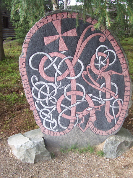
Beyond the text itself, rune stones and other inscribed objects often featured decorative imagery that complemented the inscription. Especially during the late Iron Age and Viking Age, it was common for runic inscriptions on stones to be accompanied by carvings of animals, intertwined knotwork, human figures, or scenes from mythology. These artistic elements could serve multiple purposes: they might indicate the significance of the inscription (for instance, a cross carved on a rune stone often signified a Christian memorial), or they could form part of a narrative alongside the text (such as depictions of Norse mythological scenes) (Åkerström, 2020).
The style of decoration varied by region and period. In Denmark and Sweden, elaborate interlacing patterns and zoomorphic designs (animals stylised into ribbons) appear on many rune stones, reflecting the broader art styles of the Viking Age. In England, some Anglo-Saxon stone crosses incorporate runes with Christian iconography. The decorative elements on rune-inscribed objects could also be smaller in scale: for example, rune stones which show warriors or weapons carved in relief near the runes, possibly to emphasise the commemoration of a fallen warrior (Svanelid, 2007).
A stone commissioned by Tola in memory of son Harald, currently placed at Gripsholm castle.
Photo: Måns Grebäck
Crucially, the carving of runes was sometimes itself an art. The arrangement of runes could be made to visually balance with the decoration. Carvers might stretch or compress the spacing or even the runes themselves to align with a symmetrical design on the stone. Yet they generally avoided altering the basic letter shapes for artistic effect (with one exception being bind runes , discussed below). In this way, runic inscriptions maintained readability while still contributing to the overall aesthetic of the monument or object.
Colour was another important but often overlooked aspect of runic inscriptions. Many rune stones were originally painted in vivid pigments after carving. Traces of red, black, white, and other colours have been found on rune stones, providing evidence that the letters or background were filled in with paint to make the text stand out (Moltke, 1985). For instance, the rune stone at Jelling, Denmark, retains red pigment in its grooves, and some Swedish stones show remnants of multi-colored painting. Contemporary accounts and reconstructions indicate that using several colours (rather than just one) was not uncommon, which added to both the visibility and the visual impact of the rune carving. Unfortunately, most of these pigments have worn away over the centuries, so today we usually see the stones’ bare rock. However, where preservation conditions have kept the paint (as on certain stones that were buried or indoors), the difference is striking – the runes would have been much more eye-catching in their original state.
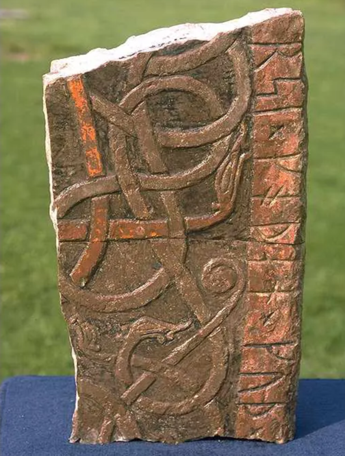
Rune stone fragment with its original painting preserved, found in the wall of a church.
Photo: Bengt A. Lundberg
Cipher Runes
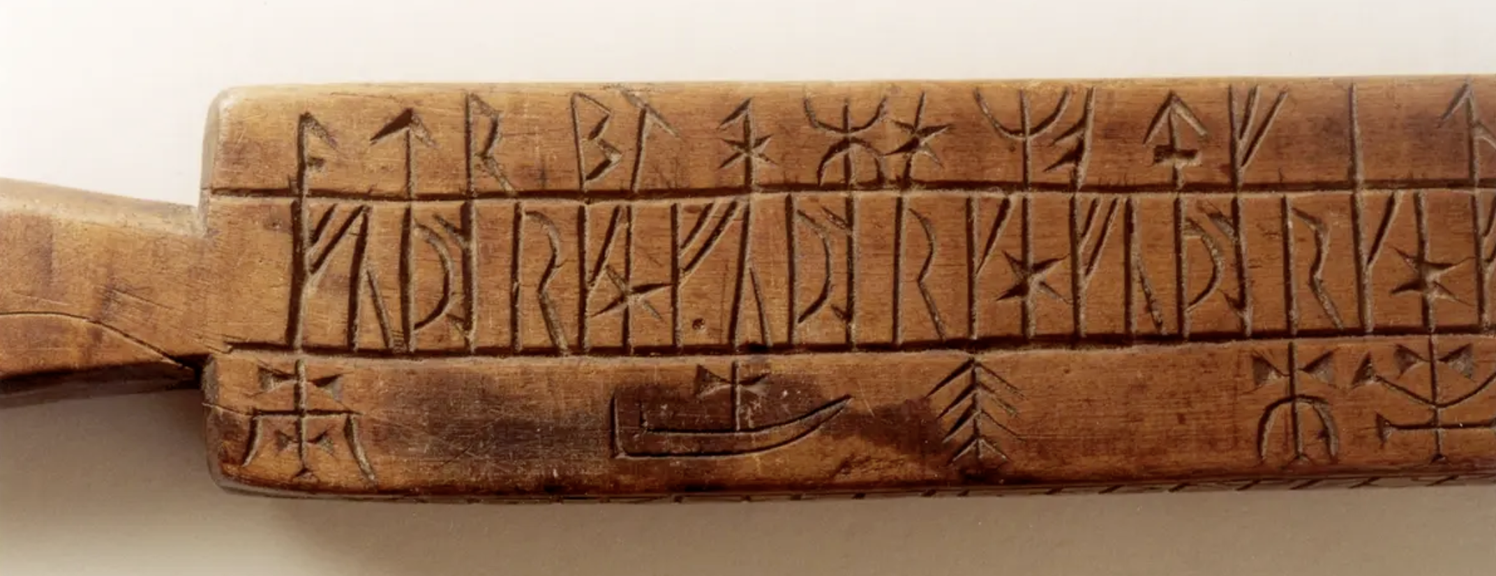
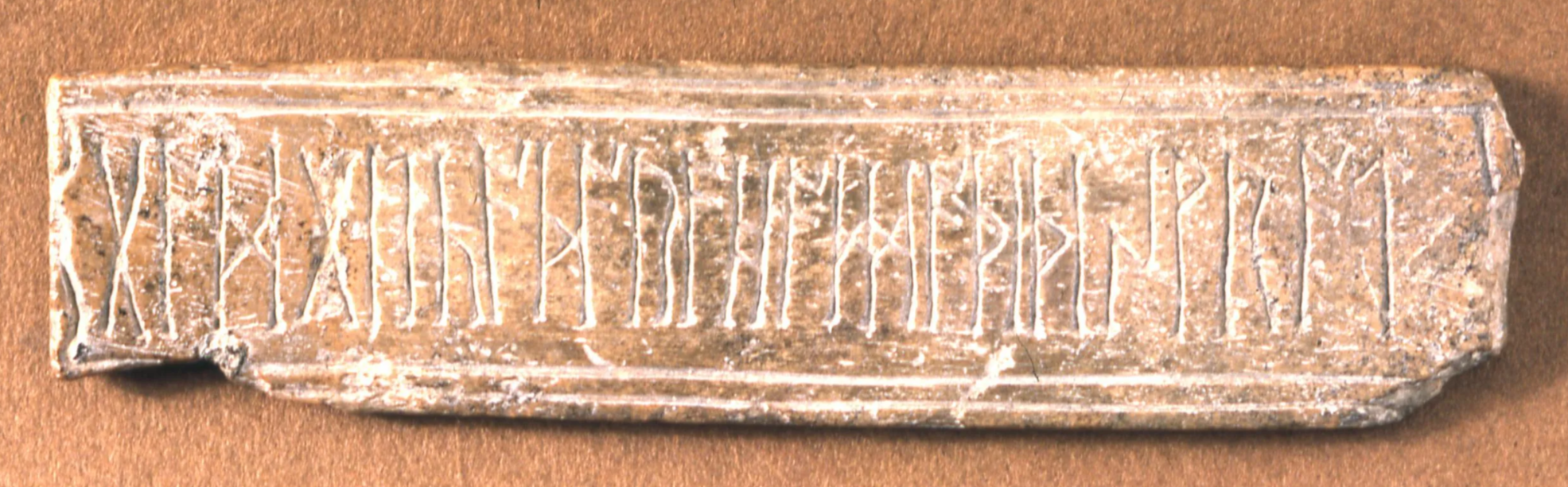
The simplicity of runes belies the fact that they could be used in clever and complex ways. One such usage was the creation of cipher runes – encoded forms of runic writing used for secrecy or magical effect. Cipher runes involve altering the standard appearance of runes according to a scheme so that the inscription is not immediately readable to the uninitiated. For example, a common method was to break each rune into constituent strokes and represent them as patterns of notches on a pair of guiding lines (somewhat analogous to tally marks). A famous example is on a Viking Age rune stick from Bergen, Norway, where a message is written in code using systematic variations of rune strokes. These encrypted runes might have been used playfully, to hide the content (perhaps love messages or trade secrets), or ritually, to imbue the text with an aura of mystery (Moltke, 1985).
Another type of cipher rune works by substituting the rune with another symbol or by rearranging the futhark order when encoding. Medieval rune manuals (like the 13th-century Codex Runicus) describe several cipher alphabets, indicating that knowledge of these techniques was part of the runic tradition. The existence of cipher runes underscores that runic literacy was not purely functional; literate rune users also experimented with their script in sophisticated ways, much as users of the Latin alphabet did with cryptograms and cyphers.
Bind Runes
A bind rune is a ligature in which two or more runes are merged or superimposed into a single glyph. This is typically done by sharing common strokes. For instance, if one rune ends in a vertical line and another begins with one, a carver might join them into one long line with the other parts attached. Bind runes appear both in early and later runic inscriptions and could serve practical or decorative purposes (Looijenga, 2003).
The Derbyshire bone plate from ca. 11th c. features a ligature of ᛞᛞ.
Photo: The British Museum, CC BY-NC-SA 4.0
Practically, combining runes saved space on an object. This was useful on small items like amulets, coins, or weapons, where the area for writing was limited. By overlapping characters, the inscriber could fit a word in a cramped space without sacrificing legibility. For example, on some bracteates (thin gold medallions with inscriptions), bind runes compress a donor’s name into a tighter form.
Decoratively, binding runes could make an inscription look more intriguing or elaborate. Some rune stones use bind runes seemingly to create a symmetric or aesthetically pleasing effect in the text.
Bind runes could involve just two letters or sometimes several. There are instances in medieval inscriptions of entire words written as one continuous bind rune string. While these can be difficult to parse, they show the flexibility of the runic script—letters could be disassembled and reassembled creatively. However, not every inscription allowed bind runes; the choice to bind was up to the carver and perhaps influenced by local custom or the formality of the text (formal memorial stones tend to use bind runes sparingly, whereas casual carvings might be more experimental).
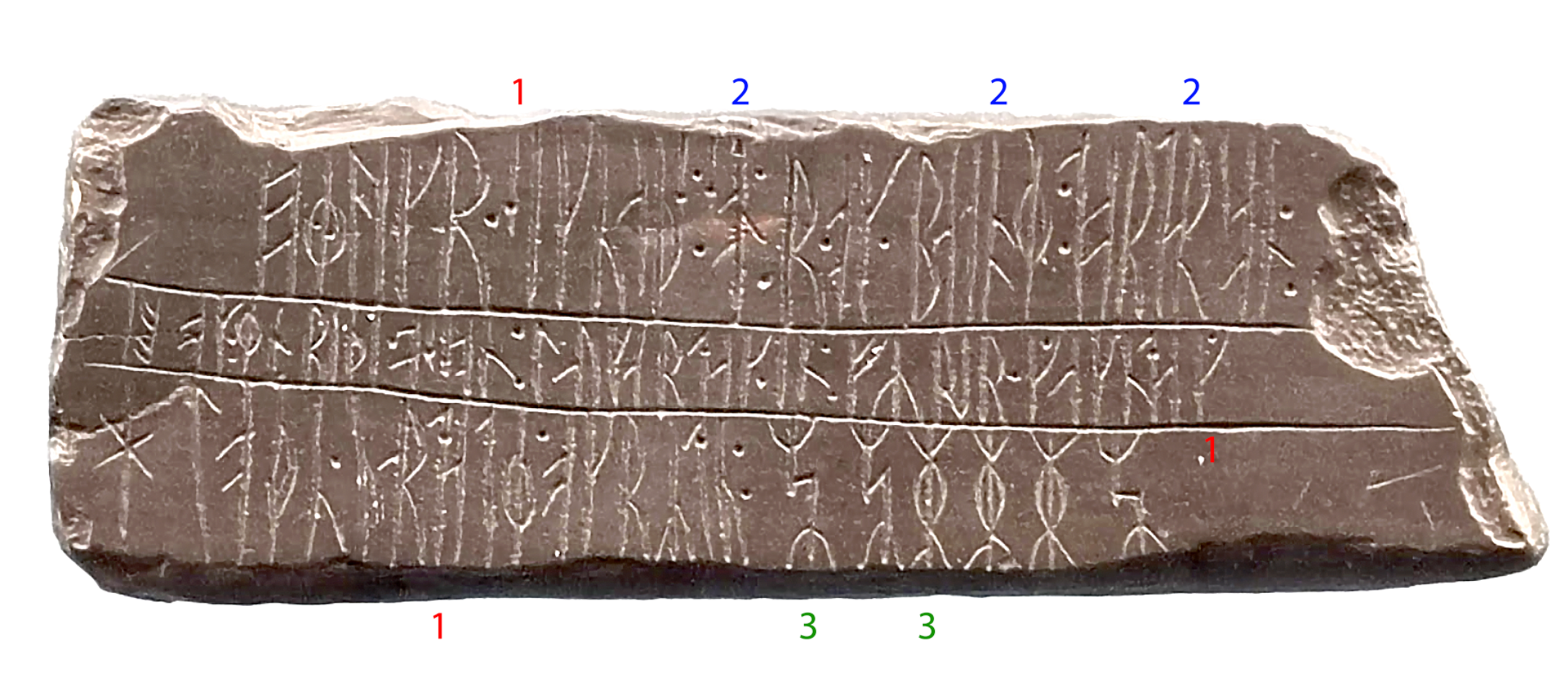
The Kingittorsuaq Runestone is a Greenlandic runestone from 13th-14th century. It features stung runes (1) as well as bind runes, as functional ligatures (2), or cryptic symbols (3).
Photo: Måns Grebäck
Anatomy of the Rune
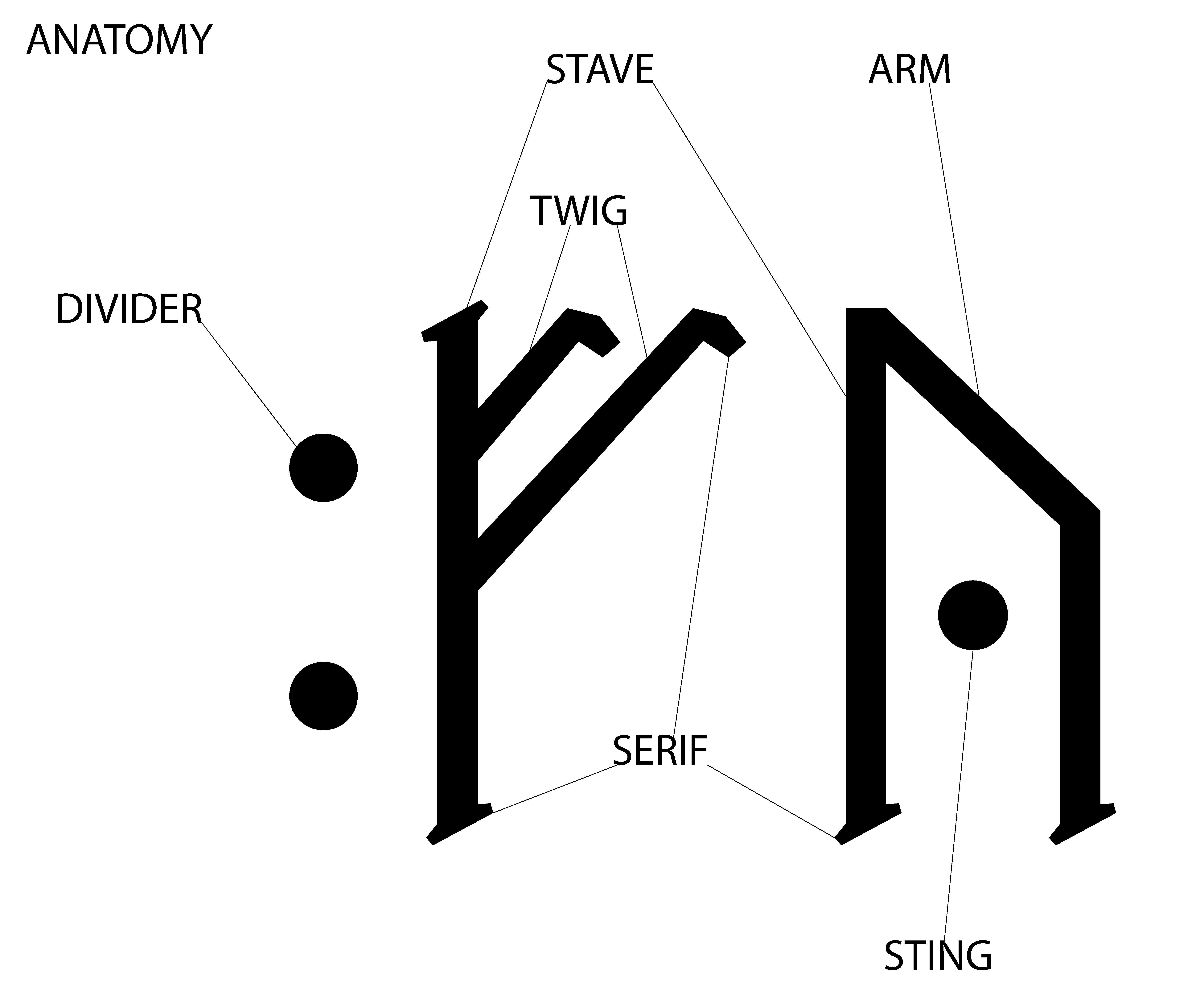
To better understand runic design, it is useful to break down the basic components of a rune character. Each rune can be described in terms of a few key elements:
- Stave: The main vertical stroke or “trunk” of a rune. Many runes have a central stave that anchors the character (for example, ᚱ (raiðō /r/), ᚦ (thurs /th/), ᚬ (ansuz /a/), etc.). Some runes have more than one stave, such as ᚻ (haglaz /h/), or none, such as ᛃ (jera /j/) has no long vertical line, being formed of angled strokes. The stave provides the primary orientation and is usually the longest line in the rune.
- Branch/Twig: A diagonal or smaller stroke attached to the stave. Branches (sometimes called twigs) often protrude at an angle and help distinguish which rune it is by their number and placement. For example, the rune ᚠ (fehu) has two diagonal branches on the upper right of the stave, whereas ᚿ (naudiz) has one branch pointing to the lower right.
- Bar/Arm: A horizontal or longer lateral stroke. In some descriptions, the term arm is used for larger strokes that extend from the stave. A notable example is ᚢ (uruz /u/), which consists of a stave and a long arm extending from the top. The “belly” of ᚦ (þurisaz /th/) can also be considered an arm. In the Elder Futhark ᛏ (tiwaz , /t/), the rune’s shape has a horizontal line at the top, like the letter T – those top lines function as arms. Essentially, arms are like branches but typically more substantial or positioned at the very top or bottom of the stave.
- Serif/Hook: A small decorative tick or flourish at the ends of strokes. While not present in early runes, by the medieval period, some runes were written with tiny hooks or serifs. For example, in manuscripts or ornamented carvings, the end of the rune ᛚ (laguz /l/) might flare slightly. These are analogous to serifs in Latin typography and were later additions to runic writing, influenced by contemporary writing styles (Åkerström, 2020). This is also a reason Unicode representations of runes may appear less primitive than runic inscriptions, as the former have serifs.
- Sting/Point/Dot: A rune could be stung/dotted/pointed in order to represent a different sound related to the sound of the main rune. For example, the letter ᚴ (kaun /k/) could be stung as ᚵ to represent /g/.
- Dividers: Not part of a single rune’s shape, but part of runic text anatomy. Dividers like dots or cross-marks separate words or sections within an inscription. A single dot (᛫) or double dot (᛬) might be placed at the same height as the middle of the runes, functioning like a space or period. In certain cases, more stacked dots are used. Some inscriptions use a ᛭ or a small × mark as a divider. These marks are ancillary but important for interpreting sentences or names in runes.
Understanding these elements helps in analysing fragmentary inscriptions. If part of a rune is missing, knowing whether it had a stave or how many branches it should have can allow scholars to guess which rune it was. For instance, if a stone is broken and only a diagonal groove remains, one can ask: Was this a branch on a stave? If so, what runes have a single branch at that angle? Such analysis is a big part of runology – the scholarly study of runic inscriptions – and has been used to successfully identify runes on damaged artefacts (Looijenga, 2003).
Futhark and Ætt Divisions
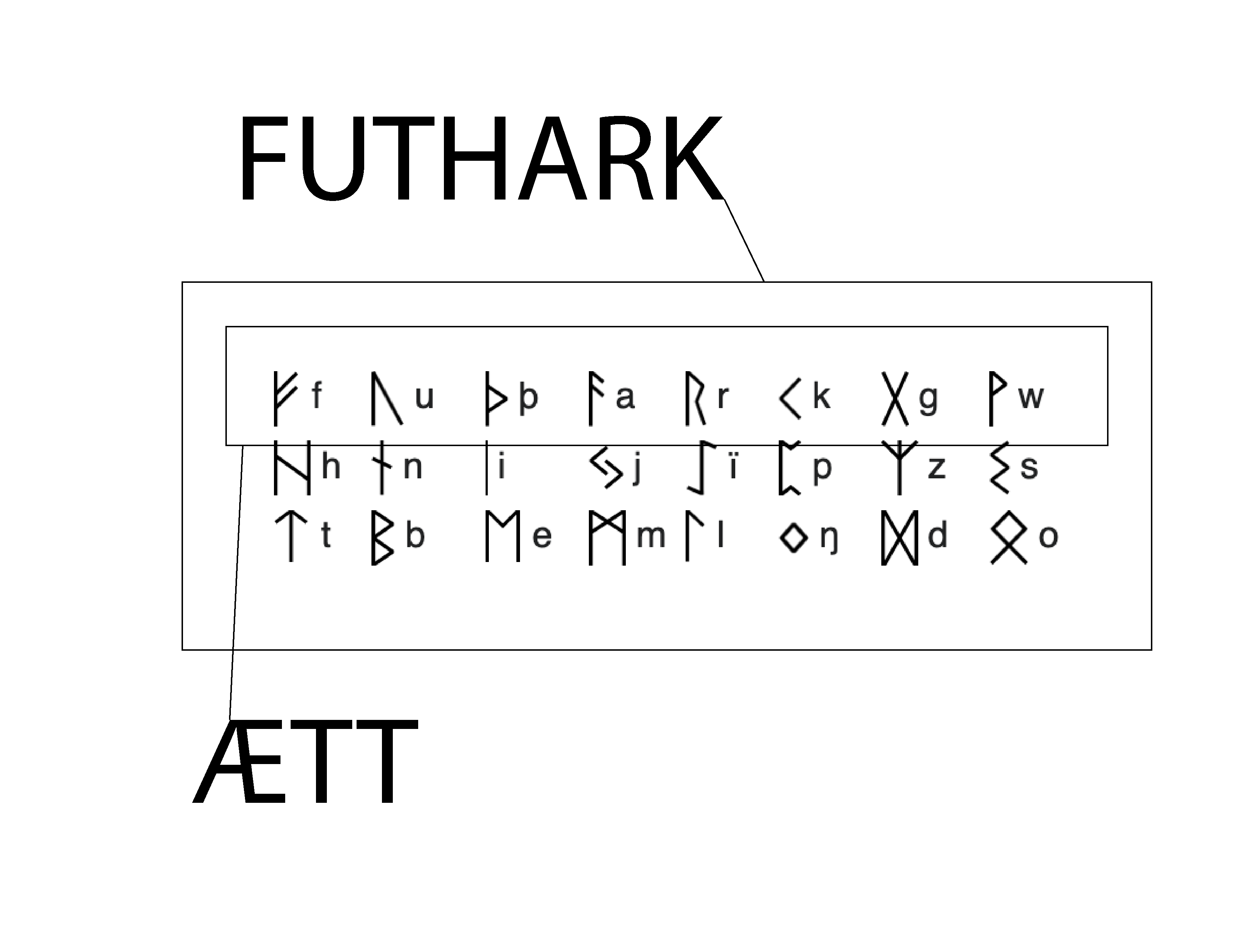
The full set of runes in a runic alphabet is called a futhark (or futhorc in the Anglo-Saxon context). This term comes from the sequence of the first letters (F, U, Þ, A, R, K). The Elder Futhark, which contained 24 characters, was traditionally ordered into three groups of eight. Each group is known as an ætt (Old Norse for “clan” or “family”). Thus, the first ætt contains ᚠ through ᚾ, the second ætt ᛁ through ᛏ, and the third ætt ᛒ through ᛟ. These ætt divisions are apparent in some written listings of the futhark – for example, the Kylver Stone (Gotland, Sweden, c. 400 AD) famously has the 24 runes of the Elder Futhark inscribed in order, with a dot or division marking the break between each ætt (Mees, 2000). This suggests that by the 5th century, users of runes were aware of the standard ordering and grouped them for memorization or perhaps for ritual significance.
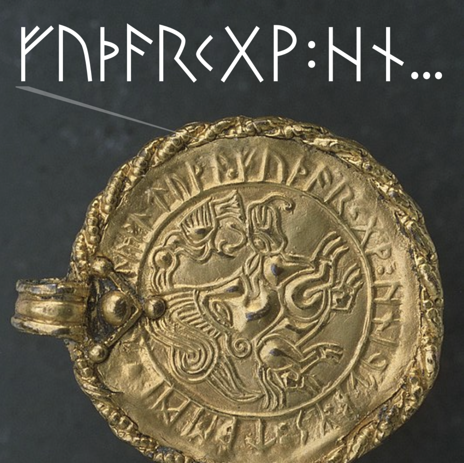
The Vadstena Bracteate displays the full runic set of characters of the area, and utilizes a colon-like character to separate the ætts. The depicted bracteate is a copy, as the original was stolen in 1938.
Photo: Ulf Bruxe, CC BY-SA 2.5
The Vadstena Bracteate displays the full runic set of characters of the area, and utilizes a colon-like character to separate the ætts. The depicted bracteate is a copy, as the original was stolen in 1938.Photo: Ulf Bruxe, CC BY-SA 2.5
Why the futhark was arranged this way remains a topic of speculation. It may have been a mnemonic device, or it could have assigned symbolic roles to each ætt. Some scholars have proposed that each ætt was associated with a particular deity or cosmological concept in Norse pagan belief (though clear evidence of this is lacking). From a practical standpoint, dividing the alphabet into smaller chunks could aid learning, as is seen in many cultures (comparable to how the alphabet song groups letters).
When the Younger Futhark of 16 runes evolved (around the 8th century), the ætt division concept became less clear, because 16 is not as neatly divisible (one could imagine two ætts of 8, but it seems the notion of ætts was not emphasised with the reduced set). However, some later medieval rune poems still mention the idea of families of runes, indicating the tradition may have persisted in a symbolic way.
Knowing the futhark order is also useful in identifying cypher runes, some of which encode letters by their position in the futhark or by ætt and number. For example, one cipher system writes a rune as a combination of two marks: one indicating the ætt (first, second, or third), and another indicating the rune’s position (1st through 8th) in that ætt (Mees, 2000). Such ciphers only make sense if both writer and reader know the standard ordering.
In summary, the runic alphabets were not random sets of symbols; they were organised systems with their own internal logic, teaching traditions, and even names (each rune had a name like fehu for ᚠ meaning “wealth,” uruz for ᚢ meaning “aurochs,” etc.). These names and the ordering show that runes were embedded in the culture and language of their users, much as the Latin alphabet was for the Romans.
Conclusion
The runic writing system stands as a fascinating example of how human cultures develop writing: it embodies both adaptation and originality. Stylistically, runes were tailored to the practical demands of carving into wood and stone, resulting in their hallmark angular and sparse forms. Yet within those constraints, runic inscriptions display a rich variety of expression – from everyday messages and memorials to complex designs intertwined with art and even cypher-like codes. This balance of function and creativity ensured that runes were not only useful for communication but also served as potent symbols of identity and mystery for the Germanic peoples.
References
Åkerström, H. (2020). Visuella textkonventioner i den tidiga vikingatidens runristningar [Master’s thesis, Uppsala University]. DiVA Portal.
Freeborn, D. (1998). From Old English to Standard English: A course book in language variation across time (2nd ed.). Ottawa: University of Ottawa Press.
Fjellhammer Seim, K. (2010). Evidence of runic and Roman script in contact in post-Viking Age Norway. Futhark: International Journal of Runic Studies, 1 , 189–196.
Jónasson, B. (2002). En liten bok om runor [A little book about runes]. Reykjavik: Gudrun.
Looijenga, T. (2003). Texts & contexts of the oldest runic inscriptions. Leiden: Brill.
Lüthi, K. (2006). South Germanic runic inscriptions as testimonies of early literacy. In M. Stoklund, M. Lerche Nielsen, B. Nielsen, & G. Fellows-Jensen (Eds.), Runes and their secrets: Studies in runology (pp. 169–182). Copenhagen: Museum Tusculanum Press.
Mees, B. (2000). The North Etruscan thesis of the origin of the runes. Arkiv för nordisk filologi , 115(1), 38–82.
Moltke, E. (1985). Runes and their origin: Denmark and elsewhere. Copenhagen: National Museum of Denmark.
Morris, R. L. (1988). Runic and Mediterranean epigraphy. Amsterdam: John Benjamins.
Palumbo, A. (2022). How Latin is runic Latin? [Master’s thesis, University of Oslo].
Pritsak, O. (1981). The origin of Rus’. Cambridge, MA: Harvard University Press.
Svanelid, T. (2007). Elitsoldater på Birka [Elite soldiers at Birka]. Populär Historia , 1, 2007.