
1. The Artist's Journey
Getting Started: What inspired your journey into calligraphy, typography, and lettering?
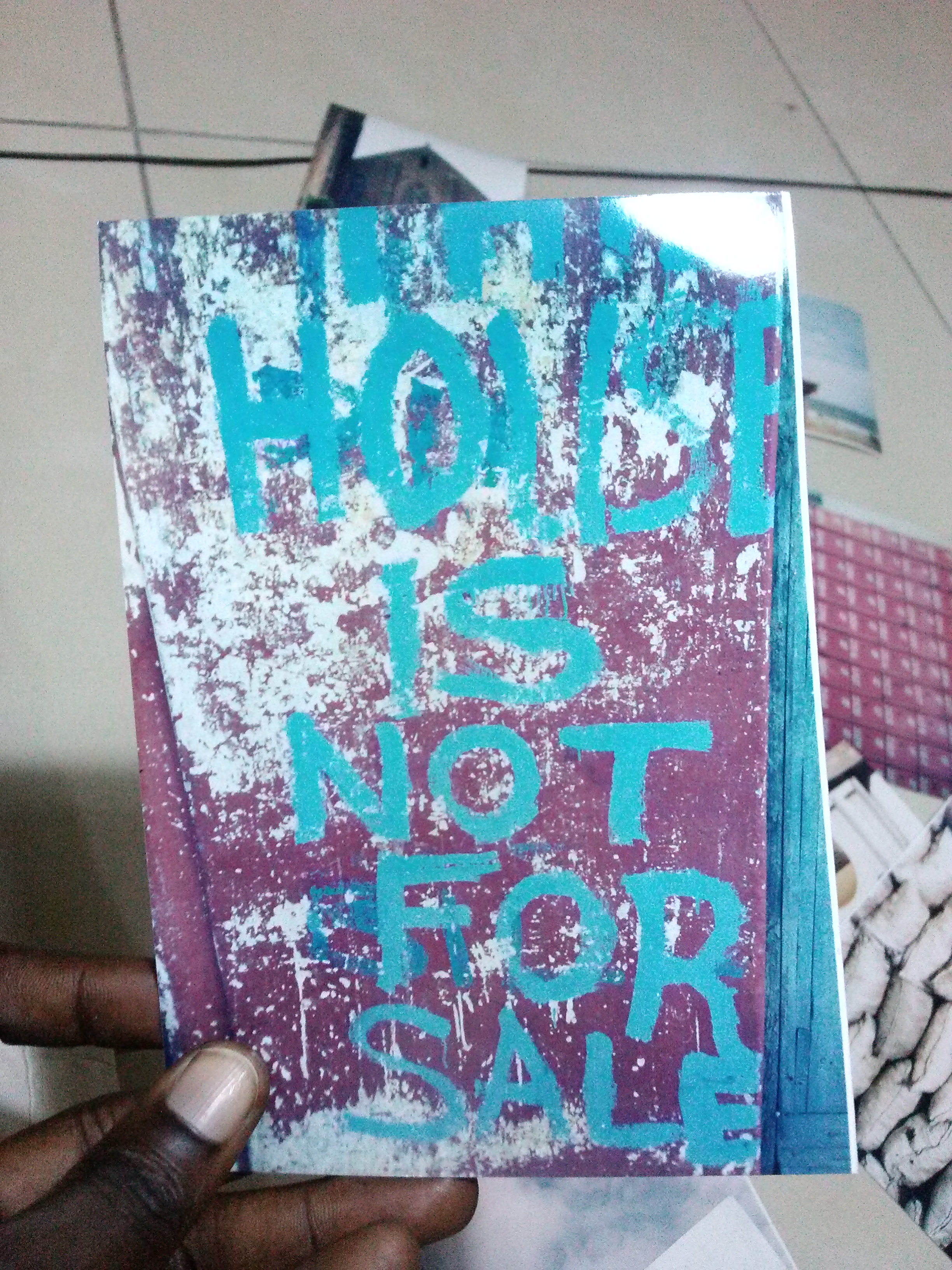
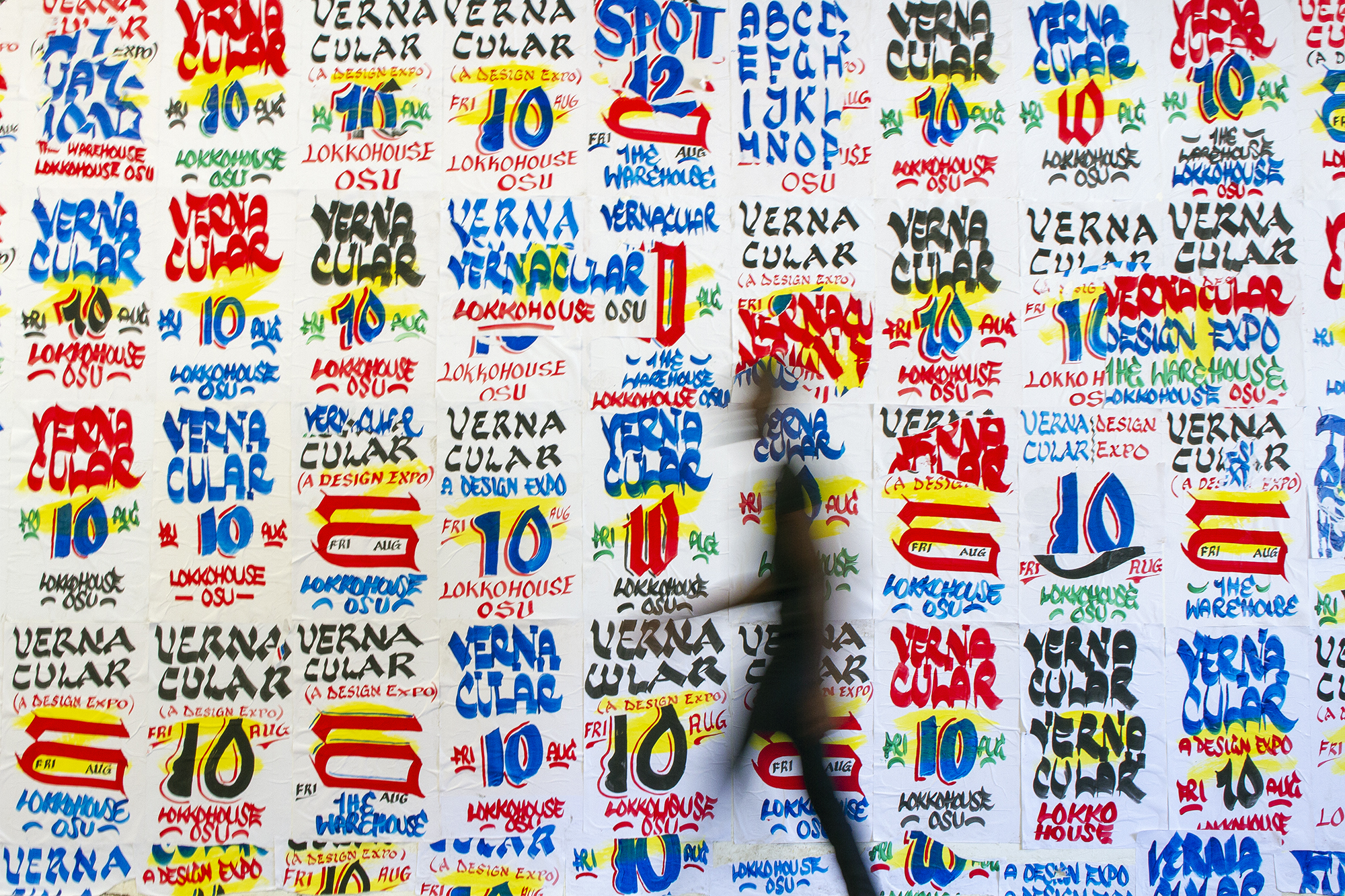
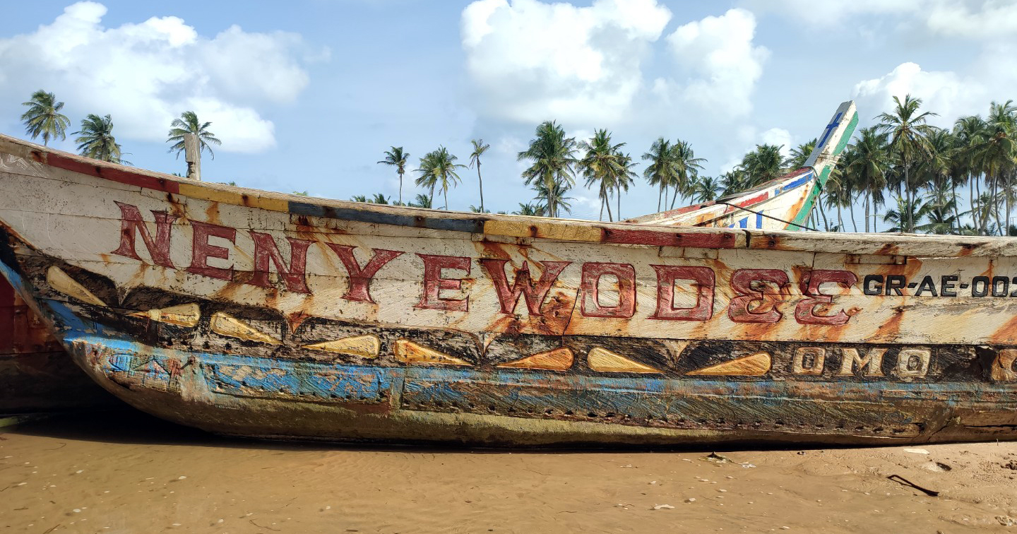
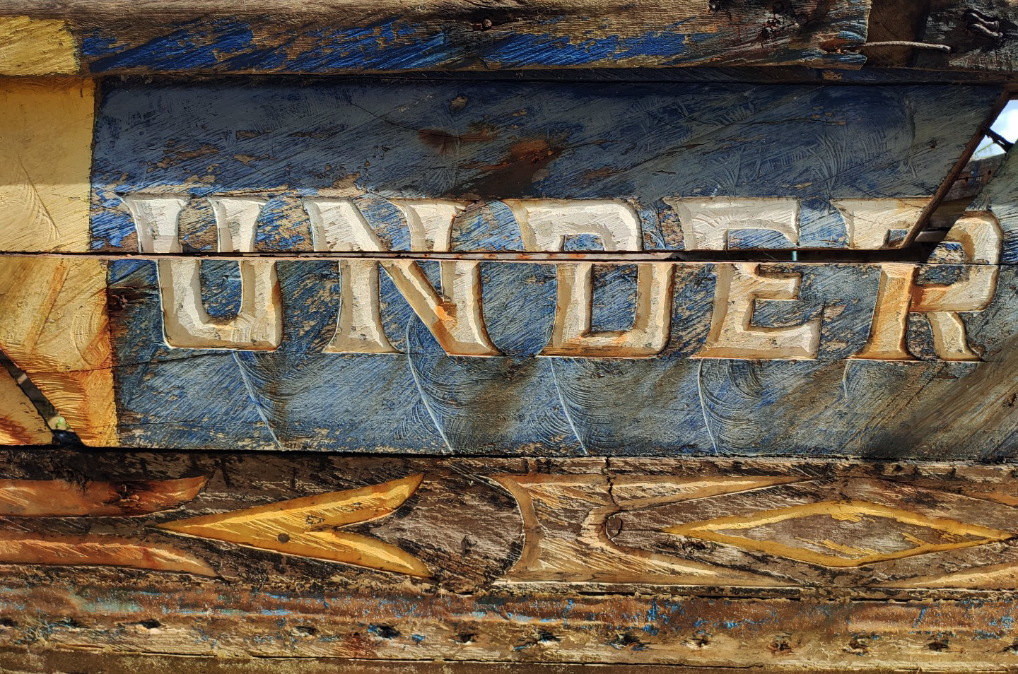
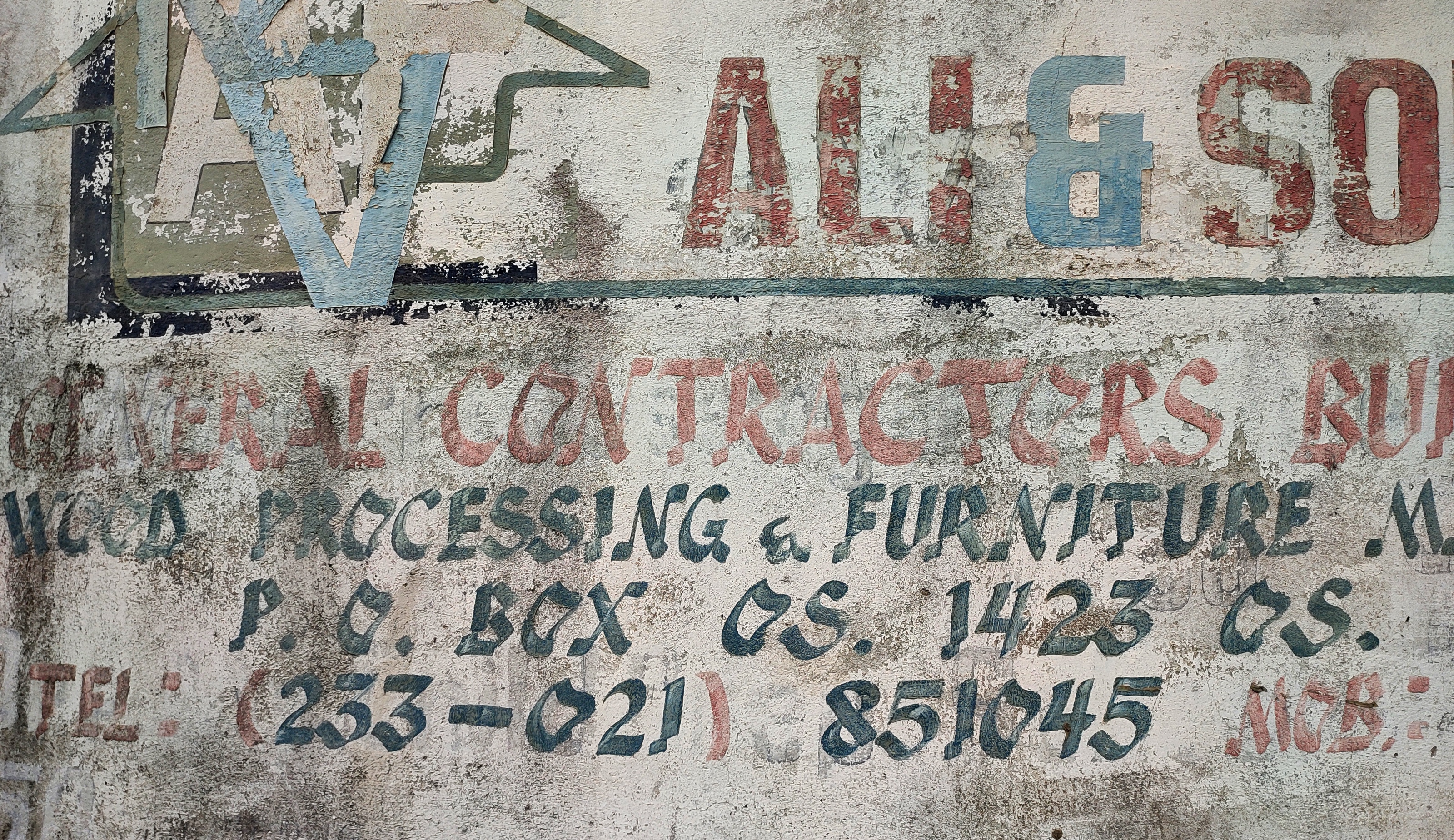
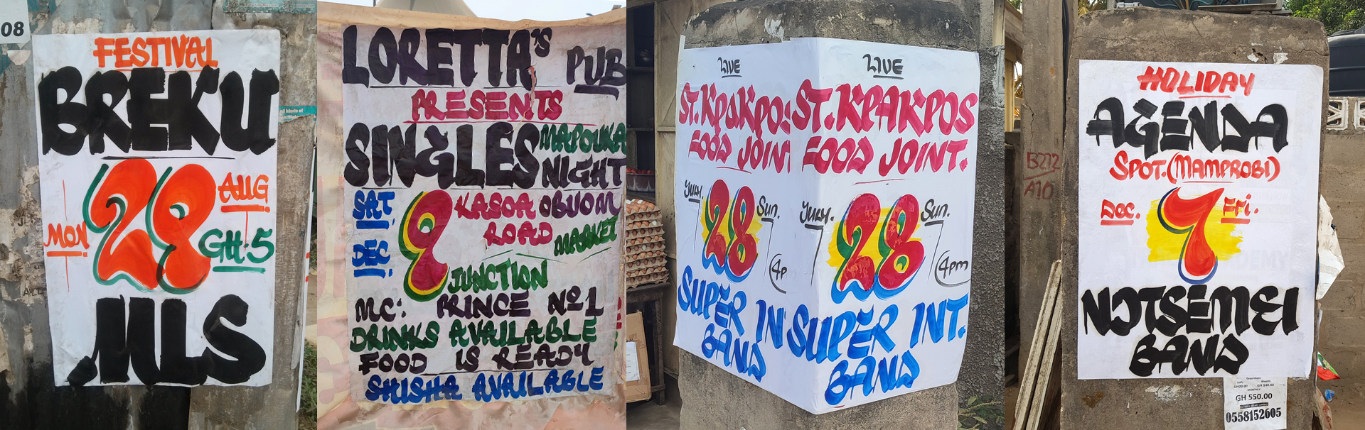
Historically, we as Ghanaians have valued handwriting. In fact, during the 1870s, it was taught as an art form in primary schools by the Basel Missionaries, and learning to write was integral to basic education. Growing up in Ghana in the 1990s, I was surrounded by vernacular typography, including hand-painted shop signs, warnings, advertising banners, and event posters plastered on walls. This visual landscape ignited my fascination with letter-forms, prompting me to explore typography more deliberately. I was particularly captivated by how handwriting and lettering embody distinct identities.

Early Experiences: Could you share your initial experiences and emotions when you first started working with lettering?
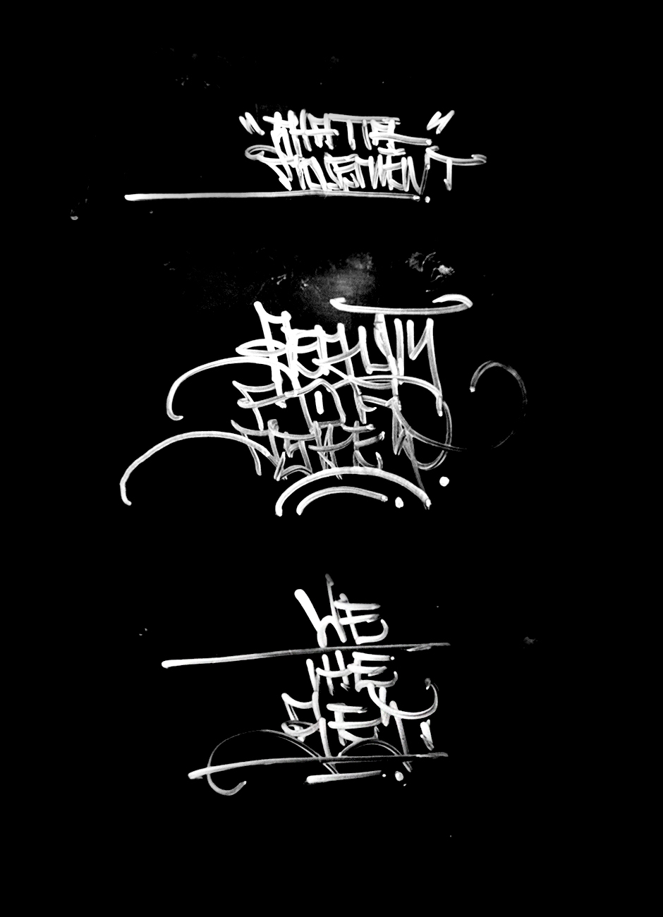
When I first delved into typography and lettering, it felt broad and almost overwhelming, yet undeniably interesting. Arguably, I had cultivated good handwriting and also loved creating, so naturally, I found myself engrossed in the craft, not neglecting the influence my environment had on me. In high school, this fascination took on a more personal touch—I began writing and designing letters for my schoolmates. Around the same time, I also started exploring graffiti tagging, experimenting with stylised letterforms and fluid strokes.
Key Milestones: What significant milestones and achievements have marked your journey?
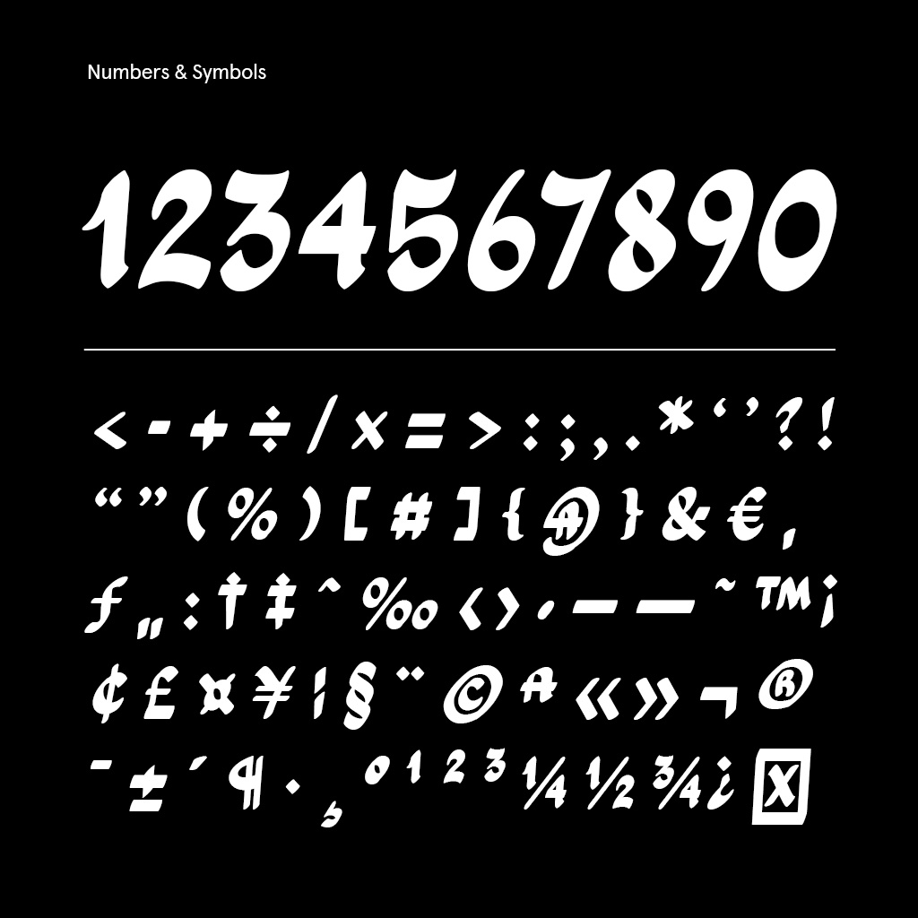
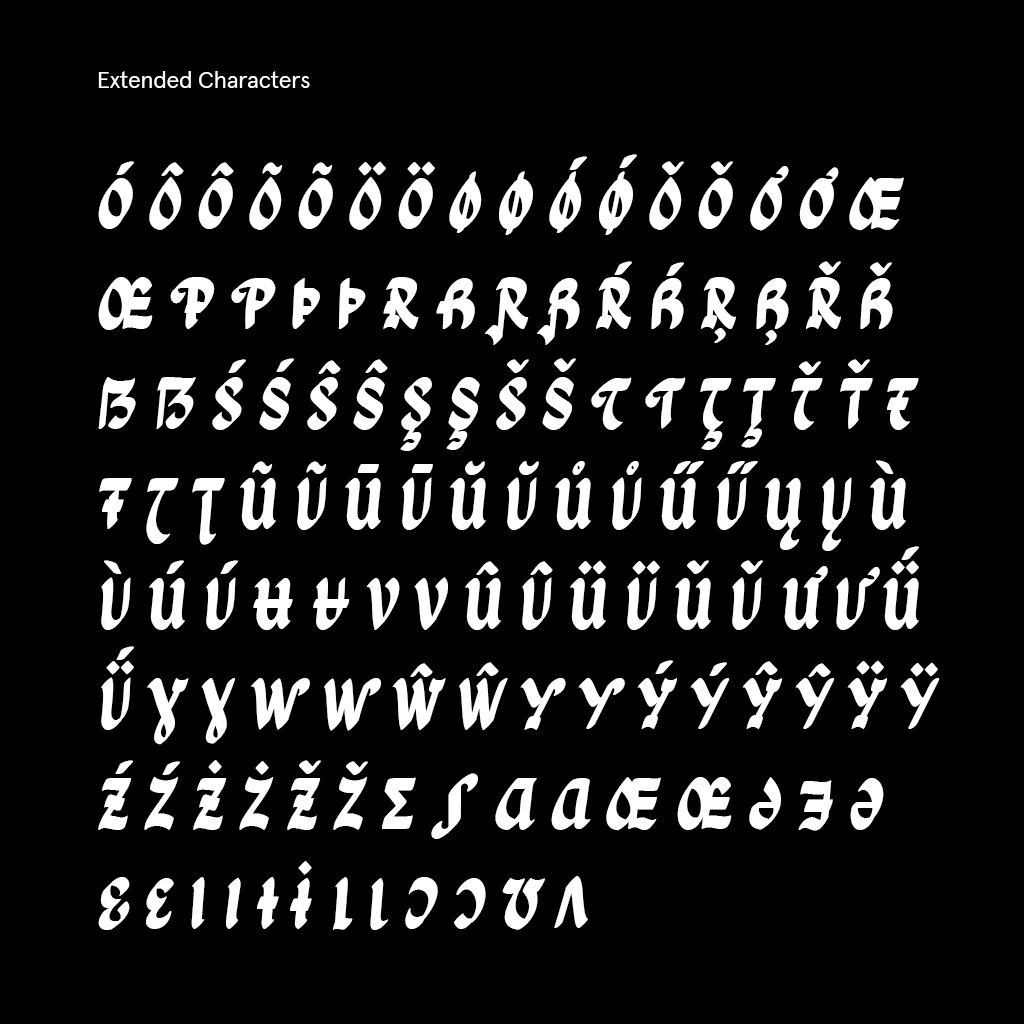
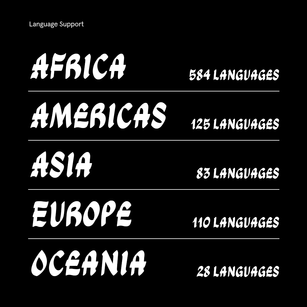
One of the significant milestones in my journey was creating and curating an exhibition that highlighted the uniqueness of vernacular typography, focusing mainly on poster writing and its significance. The exhibition emphasised the need for digital preservation and how these hand-drawn letterforms could be archived and adapted for contemporary use. Years later, this research and exploration led my team and me to be commissioned by Google Fonts to design a typeface inspired by these vernacular styles. Our goal was to create a font that remained true to its origins while being adaptable enough to support over 900 languages.

Finding Inspiration: Where do you draw your inspiration from?
I draw most of my inspiration from the world around me. Travelling allows me to observe and admire the visual language of different places—whether it’s hand-painted posters on the streets, bold warning signs, locally inspired design styles, or the details of vernacular architecture. I find meaning in everyday things and processes.
2. Discovering LTTR/INK
Why LTTR/INK: What led you to start using LTTR/INK in your work?
In the early stages of Ga Maamli, my associate Eben introduced me to LTTR/INK and suggested how it could be integrated into the project, concerning having consistent glyph sketching while embracing the brush stroke technique. Seeing it as an opportunity to explore a new tool, I embraced it and began experimenting with its potential within our creative process.
Working with LTTR/INK: How did LTTR/INK fit into your creative workflow?
In the early stages, mastering it was quite challenging due to the lack of documentation and tutorials available at the time. However, through continued experimentation, I was able to navigate its features, as it proved to be reasonably intuitive.
3. The Ga Maamli Project
Project Background: Tell us about the project where you used LTTR/INK. Where did the idea came from, what is the project backround?
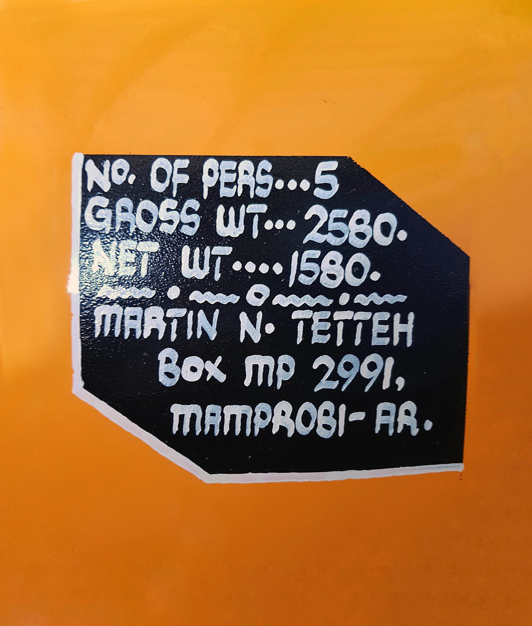
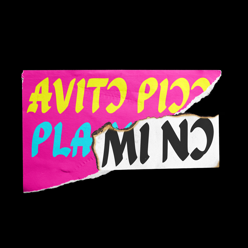
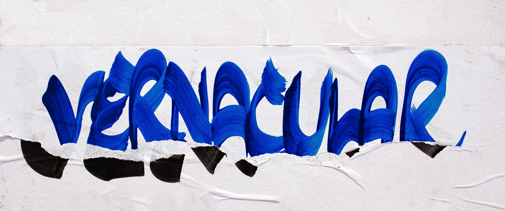
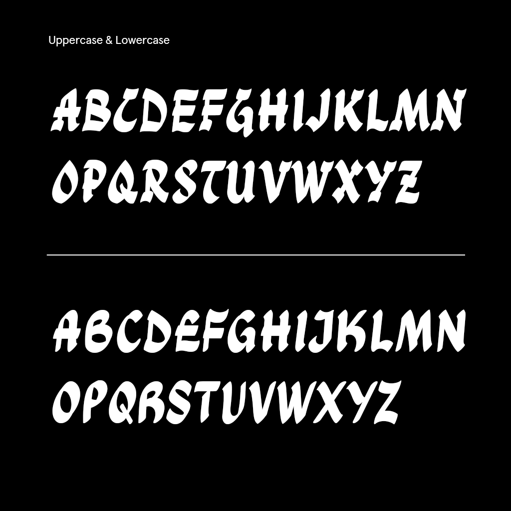
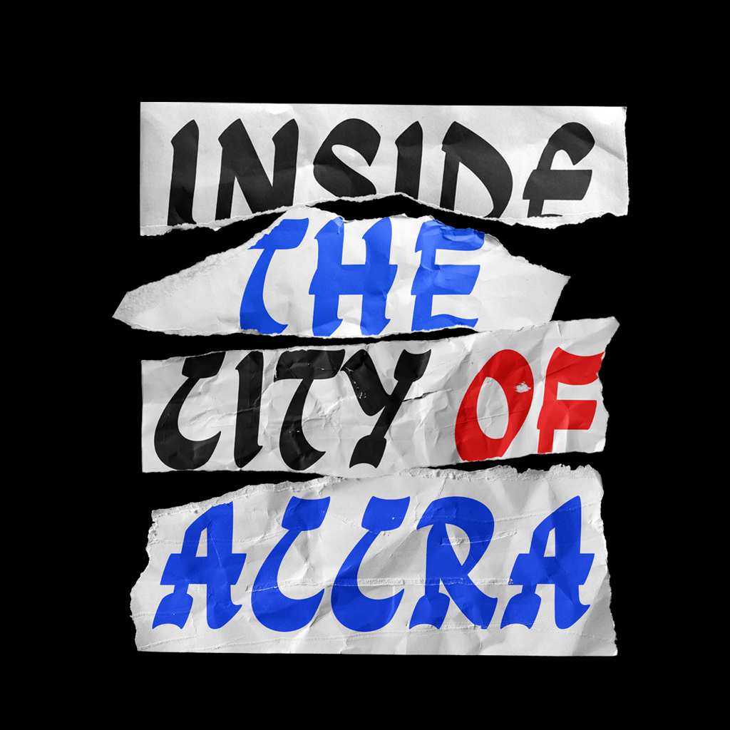
Ga Maamli is a font that was inspired by the unique handwritten posters found mainly in the coastal communities of Accra. Originally used to announce social events like concerts, boxing matches, and parties.
Project Goals: What were your aspirations when starting this project?
Earlier in my exhibition, I collaborated with graphic designers by creating Photoshop brushes for them to explore digital poster-making using this vernacular typography style. It has therefore always been my aspiration to highlight the essence of vernacular design and showcase its relevance in type design. I also wanted to find a global digital space for this unique tradition to thrive.
4. Making It Happen
Early Development: Take us through the early stages of your project. How did your ideas evolve?
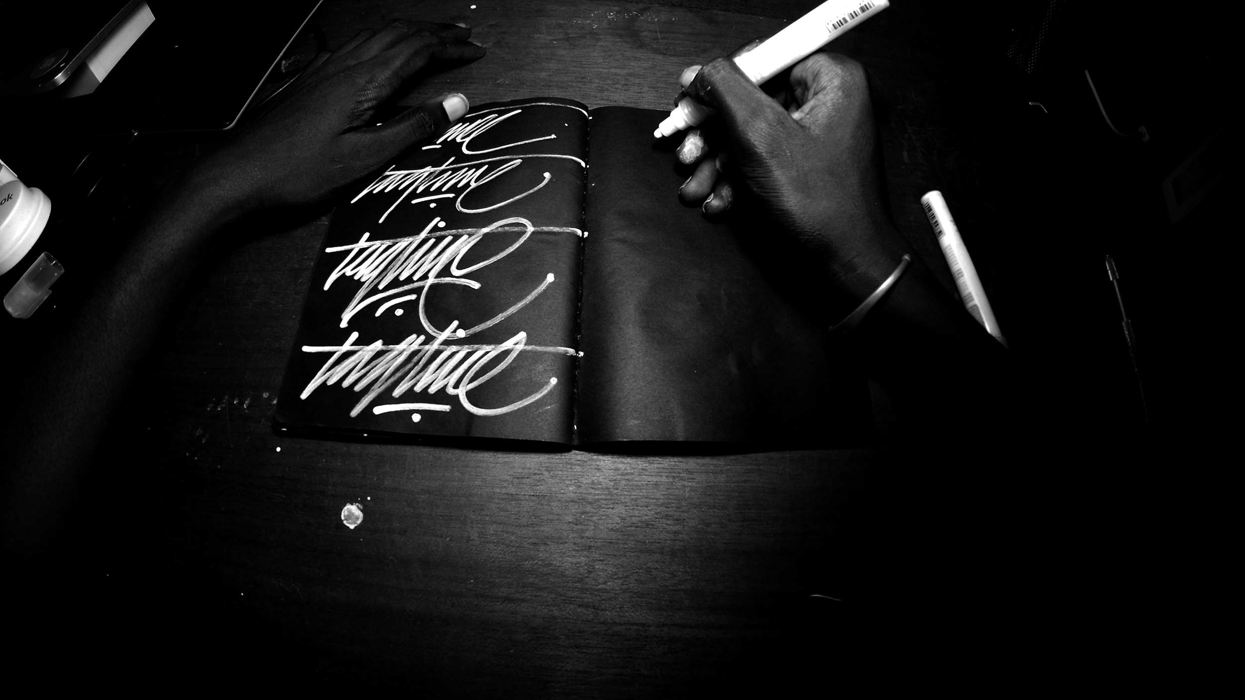
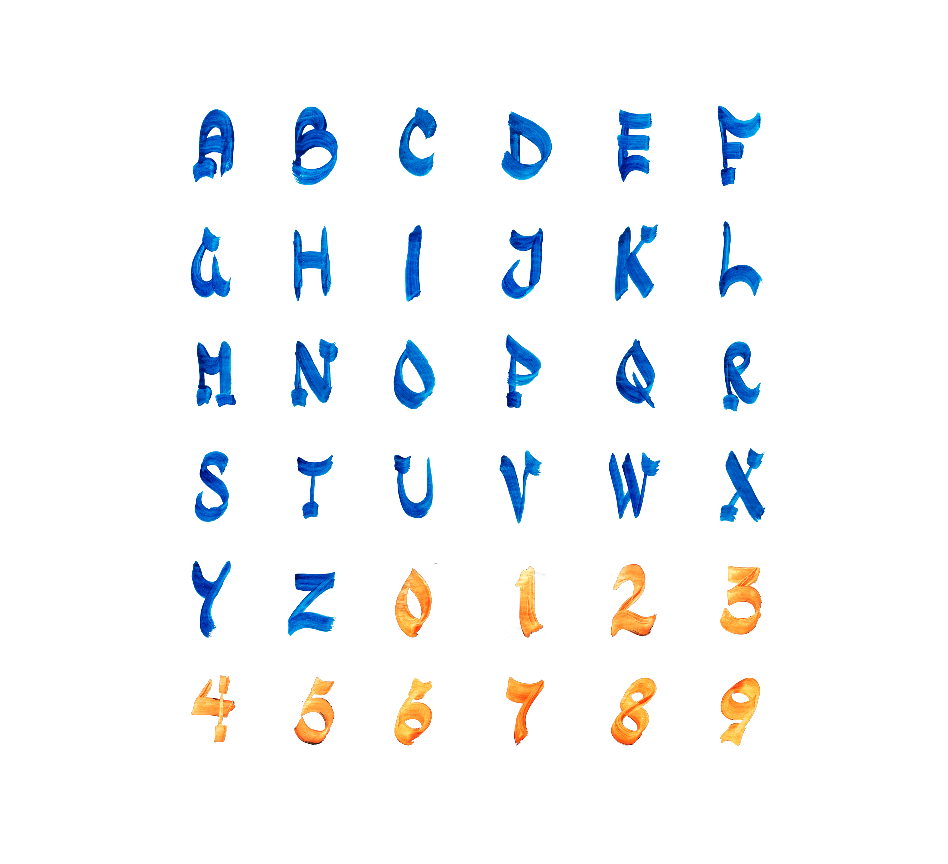
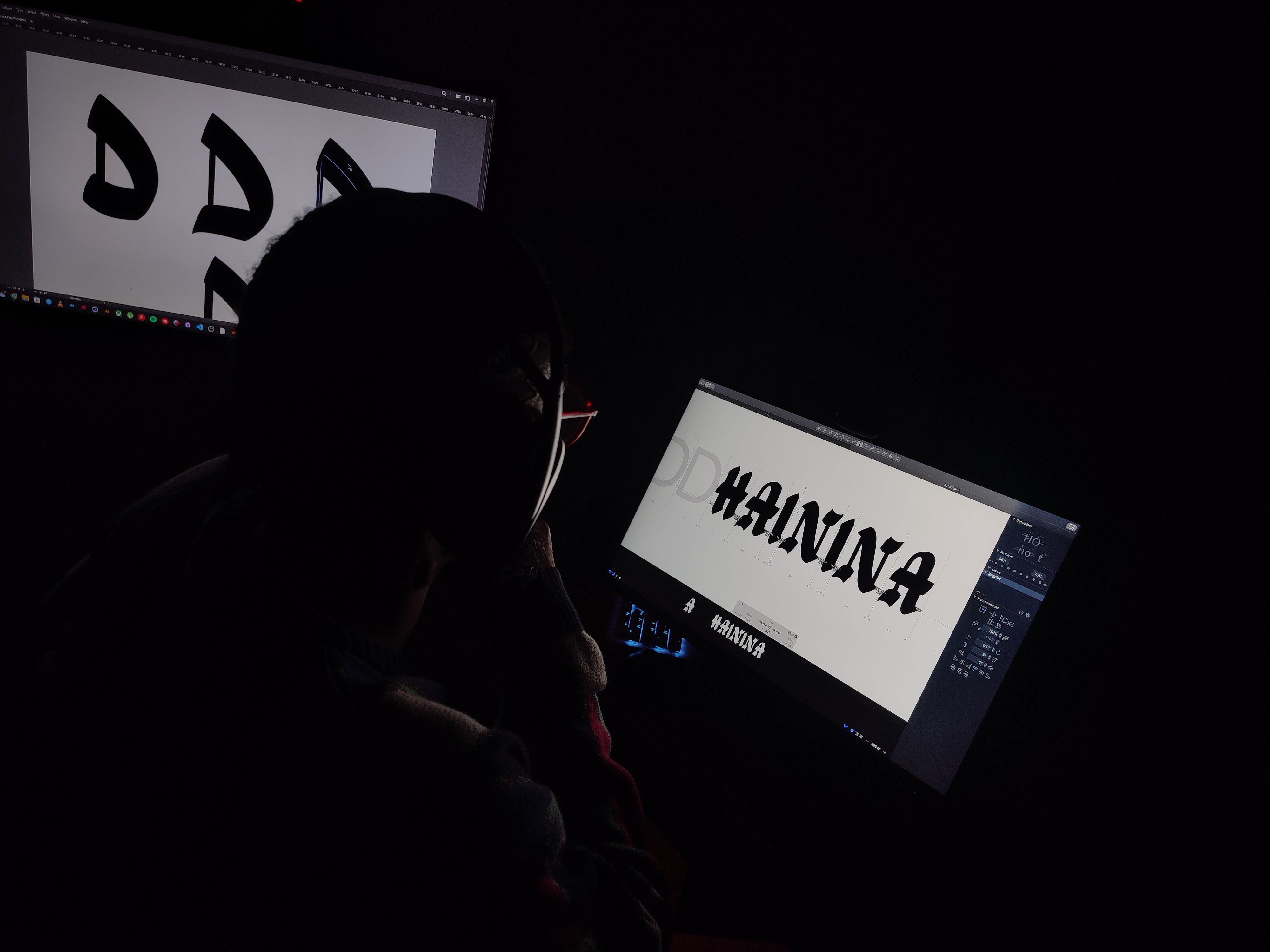
In the early stages of the project, I started by studying various posters to understand the distinct characteristics of the design we wanted to create. After, I sketched out initial letter shapes, capturing the organic and expressive forms I observed. I then scanned these sketches and refined them by rounding the shapes, but an early challenge was the lack of harmony in the overall design. To address this, I experimented with LTTR/INK first in Illustrator on behalf of the team, re-sketching and refining each letter while ensuring we stayed true to the original references. Once we achieved a more cohesive structure, we explored different styling approaches before ultimately deciding on a balance—uppercase letters would feature serifs, while lowercase letters would remain sans-serif. This process allowed the font to maintain both authenticity and usability.

Trying New Approaches: Were there any unique methods or approaches you experimented with during this project?
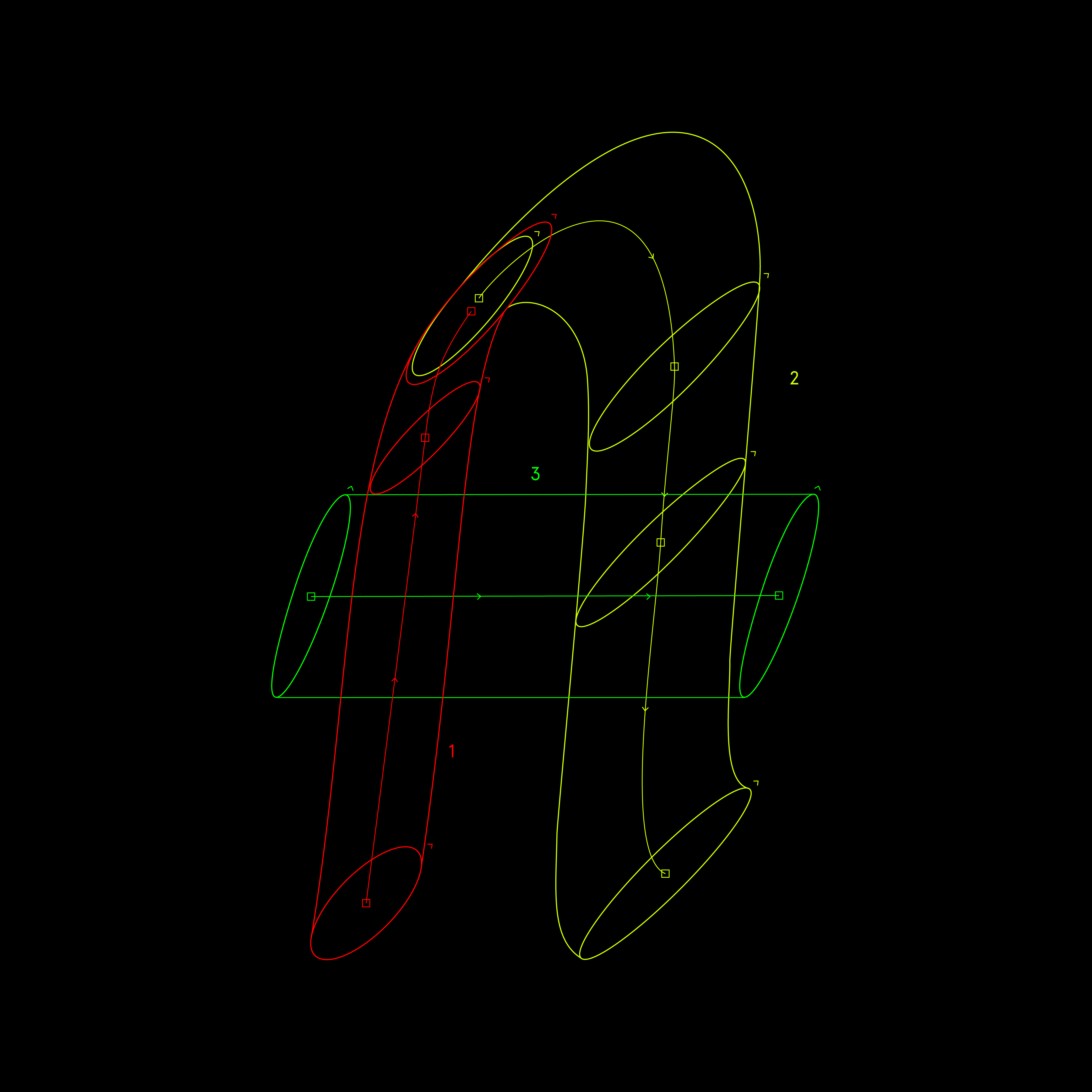
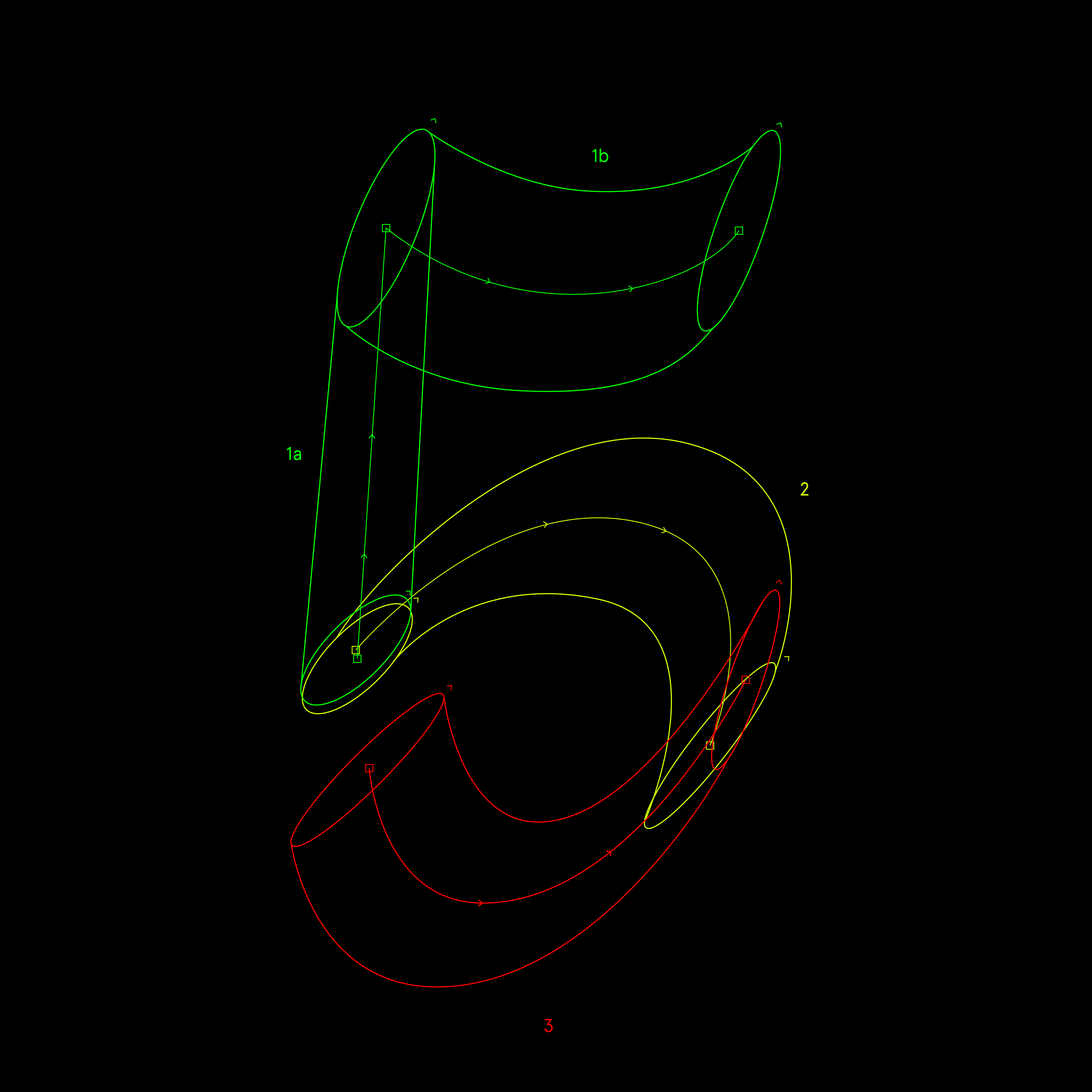
During the process, we experimented with building the characters with one stroke but varying stroke thickness. However, this made the characters too refined compared to what we were aiming for, so we decided to explore breaking the characters apart, just as you would when constructing them with a brush. This approach proved effective.
Key Discoveries: Share some important moments or discoveries that occurred while working on this project.
Reaching the latter part of this project, we realised that a few glyph designs had to be compensated for by slightly altering the design because they had different meanings in certain languages and could be mistaken or unrecognised.
Using LTTR/INK: How did you use LTTR/INK during the project, and what made it valuable?
LTTR/INK was an experimental solution for achieving structural consistency while working with organically flowing letterforms, ie, brushstrokes. The challenge was to replicate the natural flowing nature of brushstrokes from our inspirations while maintaining balance and cohesion across the typeface. By leveraging LTTR/INK’s tools, we refined each letterform, ensuring originality without compromising readability. It made the design process more efficient, allowing us to stay true to the expressive nature of vernacular typography.
5. Pro Tips
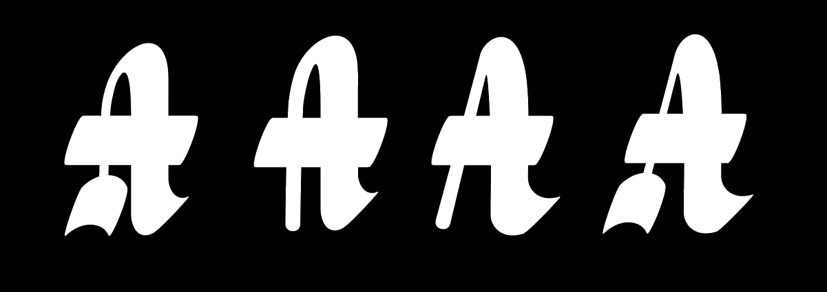
Useful Technique: Can you share an LTTR/INK trick or technique that was really helpful in your project?
One handy technique was the ability to save and repeat nib styles where necessary.
How It Works: Walk us through the step-by-step process of this technique.
In this process, one can create and save a nib style as a preset. In our case, 'across' for say horizontal strokes. Meaning, that when applied to any selected line, the nib point takes on the parameter of the preset.
6. Looking Back
What You're Proud Of: As you reflect on completing your project, what achievements are you most proud of?
What I’m most proud of is having successfully discovered a means to preserve a Ghanaian vernacular design style in the digital realm as a font. I aimed to capture the distinctive lettering styles seen on local hand-painted posters, adapting them into a functional digital typeface.

Advice to Your Younger Self: If you could offer guidance to your younger self on this creative journey, what advice would you give?
For someone who was almost steered away from design and art in general, I would encourage my younger self to be bold with every decision he wanted to pursue, learn from the process especially even if it was a failure, play, experiment more and pay more attention to your environment, because from within it inspirations arise.


